Source page: McKinsey & Company
Commentary
Transit’s ridership rut
Travel & Transportation
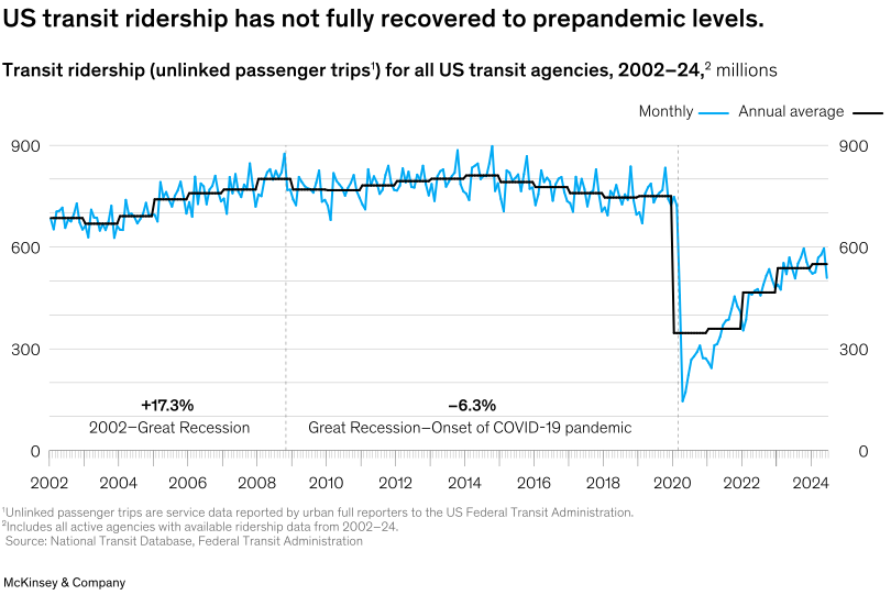
January 28, 2025 – Transit agencies in the United States are at a critical juncture, with revenue and funding unable to keep up with the rising costs of growth and innovation, note partner Anthony Shorris and coauthors. For example, on average, ridership and fare revenue remain well below prepandemic levels. Before the pandemic, monthly ridership had already declined by 5 to 10 percent. But the pandemic exacerbated this trend, and passenger levels have since stagnated at about 80 percent of prepandemic norms. The shift to remote and hybrid work is one reason for the reduced demand, and transit agencies need to adapt to meet their communities’ evolving needs and to avoid a potential fiscal cliff.
To read the article, see “Finding a route to fiscal stability for US transit agencies,” December 13, 2024.
customizer here
Visual form
Time-series line chart with monthly and annual-average overlays.
Layout / body structure
The chart is a single chart extending from 2002 through 2024. Read left to right across the timeline, using the blue monthly line for short-run volatility and the darker annual-average line for the slower trend, with dashed vertical markers separating the major economic periods.
What is being compared
It compares US transit ridership over time and contrasts monthly ridership with the smoother annual average. The chart also implicitly compares the pre-Great Recession build, the postrecession stretch, the pandemic collapse, and the partial recovery afterward.
Measurement system
The vertical axes are measured in millions of unlinked passenger trips, and the horizontal axis is calendar year. Growth annotations label the pre-Great-Recession rise and the longer decline from the Great Recession to the onset of the COVID-19 pandemic.
Visible structure inside the graphic
The graphic contains a jagged blue monthly series and a smoother black annual-average series running across the same plot. Dashed vertical reference lines divide the eras, and the steep 2020 cliff creates a dramatic break in the middle of the chart before the later rebound.
Main takeaway from the visual
The visual shows that transit ridership never fully returned to its prepandemic level after the 2020 collapse. Even though the lines recover materially after the trough, they level off far below the earlier plateau that held through much of the mid-2000s and 2010s.
Key standout values or extremes
The chart marks a 17.3 percent rise from 2002 to the Great Recession, followed by a 6.3 percent decline from the Great Recession to the onset of the pandemic. Monthly ridership drops from roughly the 700-to-800-million range before 2020 to near 150 million at the trough, and then only recovers to around the mid-500s by 2024.
Controls / sequence, when applicable
This is a static chart image with no in-chart controls to operate.
Companion media, when applicable
There is no separate companion audio or video; the chart image is the full visual on this page.