Source page: McKinsey & Company
Commentary
The energy transition is just beginning
Sustainability | Renewable energy | Climate change
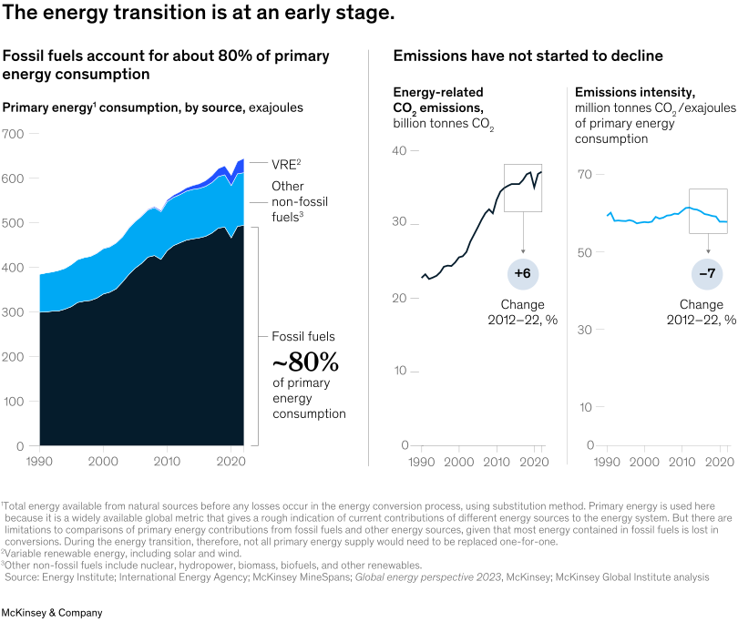
October 7, 2024 – The global energy transition is still in its infancy, and fossil fuels remain the predominant source of primary energy consumption. Senior partner Chris Bradley and coauthors emphasize the urgency of accelerating the transition to cleaner energy sources, as energy-related CO2 emissions continue to rise despite a slight decline in emissions intensity between 2012 and 2022. The deployment of low-emissions technologies has begun, but represents only 10 percent of what’s required by 2050 in most areas.
To read the report, see “The hard stuff: Navigating the physical realities of the energy transition,” August 14, 2024.
customizer here
Visual form
Multi-panel combination chart with a stacked area chart and two line charts.
Layout / body structure
The chart is arranged in three side-by-side panels. The left panel is a long-run stacked area view of primary energy consumption by source, and the two right panels are smaller line charts for total energy-related CO2 emissions and emissions intensity, so the page is read left to right across supply mix, emissions level, and emissions efficiency.
What is being compared
It compares how primary energy consumption has been split between fossil fuels, other non-fossil fuels, and variable renewables over time, and then pairs that with two emissions views: total energy-related carbon emissions and emissions intensity per unit of primary energy consumed.
Measurement system
The left panel uses exajoules on the vertical axis, while the middle panel uses billion tonnes of CO2 and the right panel uses million tonnes of CO2 per exajoule of primary energy consumption. The chart also calls out the 2012 – 22 change in each emissions panel with circular annotations showing +6 percent for total emissions and -7 percent for emissions intensity.
Visible structure inside the graphic
The left panel stacks three colored bands, with fossil fuels forming the large dark base, other non-fossil fuels layered above, and a thin renewable band at the top. The two right panels each use a single line, small callout boxes, and change markers, so the viewer can compare level and direction across the two emissions measures.
Main takeaway from the visual
The graphic shows that the energy transition is still early because fossil fuels remain the overwhelming base of primary energy use while absolute emissions have not begun to fall. Efficiency improves somewhat, but that gain is not yet strong enough to pull the total-emissions line downward.
Key standout values or extremes
The left panel explicitly marks fossil fuels at about 80 percent of primary energy consumption. The middle panel’s line rises into the mid-30-billion-tonne range and is labeled +6 percent from 2012 to 2022, while the intensity line in the right panel trends down only modestly and is labeled -7 percent over the same period.
Controls / sequence, when applicable
This is a static chart image with no in-chart controls to operate.
Companion media, when applicable
There is no separate companion audio or video; the chart image is the full visual on this page.