Source page: McKinsey & Company
Commentary
Happy planting?
Sustainability | Infrastructure
October 9, 2023 – Designing and delivering factories for green technologies (such as hydrogen) is one of the great challenges of the net-zero transition, as cost overruns and extended timelines for capital projects are common. According to senior partner Zak Cutler and colleague, industrializing the end-to-end process of completing big factory projects, also known as the plant-as-a-product approach, can lower capital expenditure costs by as much as 75 percent over time. A reduction in capital expenditures for batteries and solar and wind technologies shows that scaling the green tech of the future is tough but within reach.
To read the article, see “The plant as a product: Hyperscaling green capex,” September 7, 2023.
customizer here
Visual form
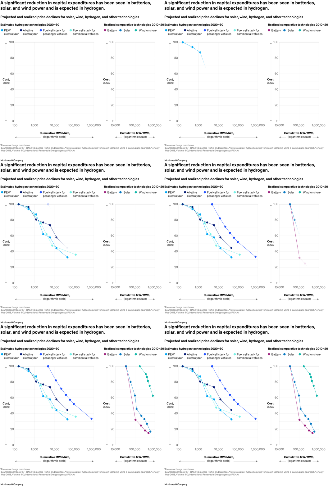
Two-panel learning-curve comparison chart. It uses multiple line trajectories to compare projected and realized cost declines.
Layout / body structure
The chart is split into two side-by-side panels: the left side shows estimated hydrogen technologies from 2020 to 2030, and the right side shows realized comparative technologies from 2010 to 2020. Both panels share the same basic reading logic, with cost on the vertical axis and cumulative scale on the horizontal axis.
What is being compared
It compares projected and realized price declines for solar, wind, hydrogen, and related technologies. Within hydrogen, it further separates PEM electrolyzers, alkaline electrolyzers, and fuel-cell stacks for passenger and commercial vehicles.
Measurement system
The y-axis is a cost index, and the x-axis is cumulative MW or MWh on a logarithmic scale. Color distinguishes the different technology paths.
Visible structure inside the graphic
Each panel is built from multiple colored learning curves plotted on matching axes, with a legend across the top identifying the technologies. The left panel is forward-looking for hydrogen technologies, while the right panel supplies historical reference lines for battery, solar, and wind.
Main takeaway from the visual
The chart argues that green-tech capex can fall sharply as deployment scales. By placing projected hydrogen curves beside already-realized declines in battery, solar, and wind, the chart frames hydrogen as following a familiar learning-curve story rather than as a one-off exception.
Key standout values or extremes
The title sets the headline extreme by saying that capital expenditures have already fallen significantly in batteries, solar, and wind and are expected to do the same in hydrogen. The most important visual contrast is the parallel downward slope pattern across both panels.
Controls / sequence, when applicable
This is a static chart image with no in-chart controls to operate.
Companion media, when applicable
There is no separate companion audio or video; the chart image is the full visual on this page.