Source page: McKinsey & Company
Commentary
Global growth goals
Sustainability | Economic Development
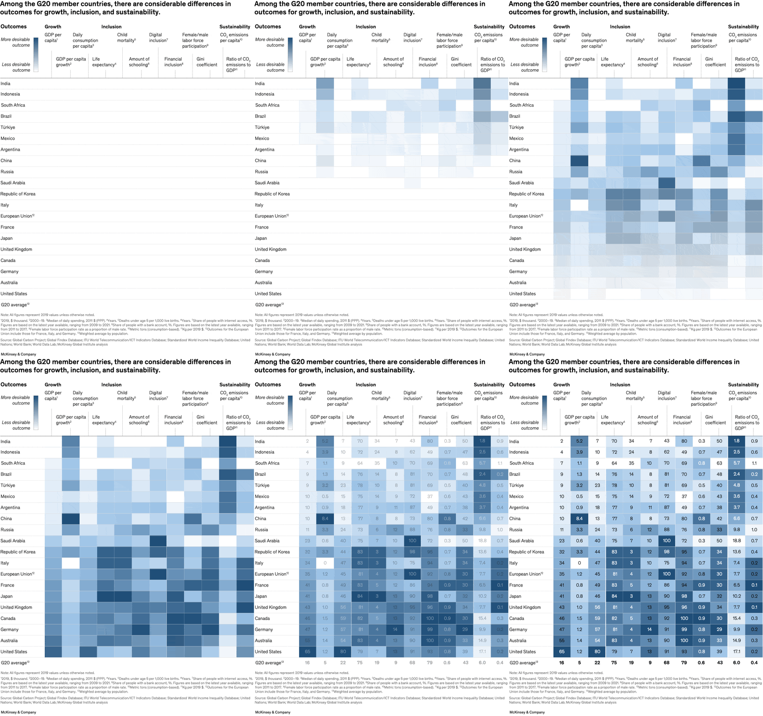
December 22, 2022 – Three interlocking goals—sustainability, inclusion, and growth—are critical for realizing a better global future. Senior partners Kweilin Ellingrud, Sven Smit, and Jonathan Woetzel and coauthors explore the tensions and trade-offs that can accompany the efforts to achieve these goals. For example, G20 member countries with lower incomes emit less CO2 per capita than wealthier economies, but they also tend to show less-desirable outcomes on inclusion measurements.
To read the report, see “Toward a sustainable, inclusive, growing future: The role of business,” November 13, 2022.
As 2022 comes to a close, be sure to browse through our feature, “2022: The year in charts,” which illuminates many of the ways the world is striving toward sustainable, inclusive growth. Charting the Path to the Next Normal will go on a brief hiatus starting December 23, 2022 and will return January 3, 2023. In the meantime, check out “What just happened?,” for McKinsey Publishing’s month-by-month journey through 2022.
customizer here
Visual form
Bubble scatter plot.
Layout / body structure
The chart is laid out as a two-axis comparison with countries positioned across a field and bubble markers carrying the third dimension. Reader scans the full scatter, then looks at where individual G20 economies sit relative to one another on growth, inclusion, and sustainability.
What is being compared
It compares G20 member countries across the three interlocking goals of growth, inclusion, and sustainability, with the visual built to show the trade-offs among them rather than isolate one metric at a time.
Measurement system
The chart combines at least two axis-based outcome measures with a third dimension encoded in bubble size or an equivalent marker treatment. Country labels identify each point, so the viewer tracks position and relative scale together.
Visible structure inside the graphic
The main internal pieces are the country markers spread across the plot, the axis labels that define the evaluation space, and the bubble or marker sizing that adds the third goal to the comparison. The scatter layout makes clusters and outliers visible instead of forcing a ranking.
Main takeaway from the visual
The chart shows that the three goals do not line up evenly across the G20. Lower-income members can look better on per-capita emissions while lagging on other dimensions, and wealthier economies can score differently on inclusion and growth, so the page reads as a map of trade-offs rather than a single leaderboard.
Key standout values or extremes
The strongest emphasis is on the spread between countries rather than one dominant headline number. The visual contrast comes from how far apart the G20 members sit from one another once growth, inclusion, and sustainability are placed in the same frame.
Controls / sequence, when applicable
This is a static chart image with no in-chart controls to operate.
Companion media, when applicable
There is no separate companion audio or video; the chart image is the full visual on this page.