Source page: McKinsey & Company
Commentary
Paycheck pinch
Inflation | Economy | Jobs
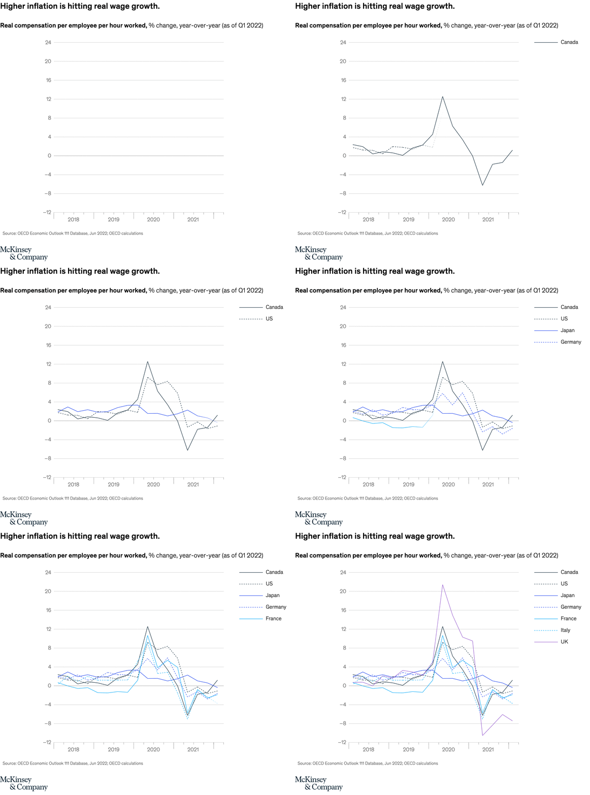
July 22, 2022 – Real wages had been flat for several years in most OECD countries until just before the pandemic. Then they soared as labor markets tightened. Widespread inflation has stifled these wage gains, hindering the purchasing power of consumers’ take-home pay.
To read the article, see “How inflation is flipping the economic script, in seven charts,” July 6, 2022.
customizer here
Visual form
Multi-line time-series chart.
Layout / body structure
The chart is a single chart read left to right from 2008 to 2022, with country lines added one by one into the same plotting area and labels set on the right edge. The note sits beneath the chart after the viewer has traced the full wage cycle.
What is being compared
The chart compares real compensation per employee per hour worked across a set of OECD countries, including Canada, the United States, Japan, Germany, France, and Italy. It shows how their year-over-year wage growth moved through the pandemic and into the inflation surge.
Measurement system
The vertical axis is a percent change measure for real compensation per employee per hour worked, year over year, as of the first quarter of 2022. The horizontal axis is time, and color is used to separate countries rather than splitting them into separate panels.
Visible structure inside the graphic
The lines sit close together through much of the pre-pandemic period, then all react sharply around 2020 before spreading out again. One line spikes above 12 percent, several others rise into the mid-single digits, and a few swing below zero by the end of the series, making the post-spike divergence easy to see.
Main takeaway from the visual
The picture shows wage growth briefly surging when labor markets tightened, then losing momentum as inflation took hold. By the right edge of the chart, the extraordinary gains of 2020 have largely faded and some country lines have slipped back into negative real-wage territory.
Key standout values or extremes
The most prominent spike on the chart rises a bit above 12 percent around 2020, while the weakest trough later falls to roughly negative 6 or 7 percent. Most of the country lines cluster near low single digits by early 2022, which underscores how much the earlier wage burst has been squeezed back down.
Controls / sequence, when applicable
This is a static chart image with no in-chart controls to operate.
Companion media, when applicable
There is no separate companion audio or video; the chart image is the full visual on this page.