Source page: McKinsey & Company
Commentary
Paying more to fill plates
Inflation | Economy | Food
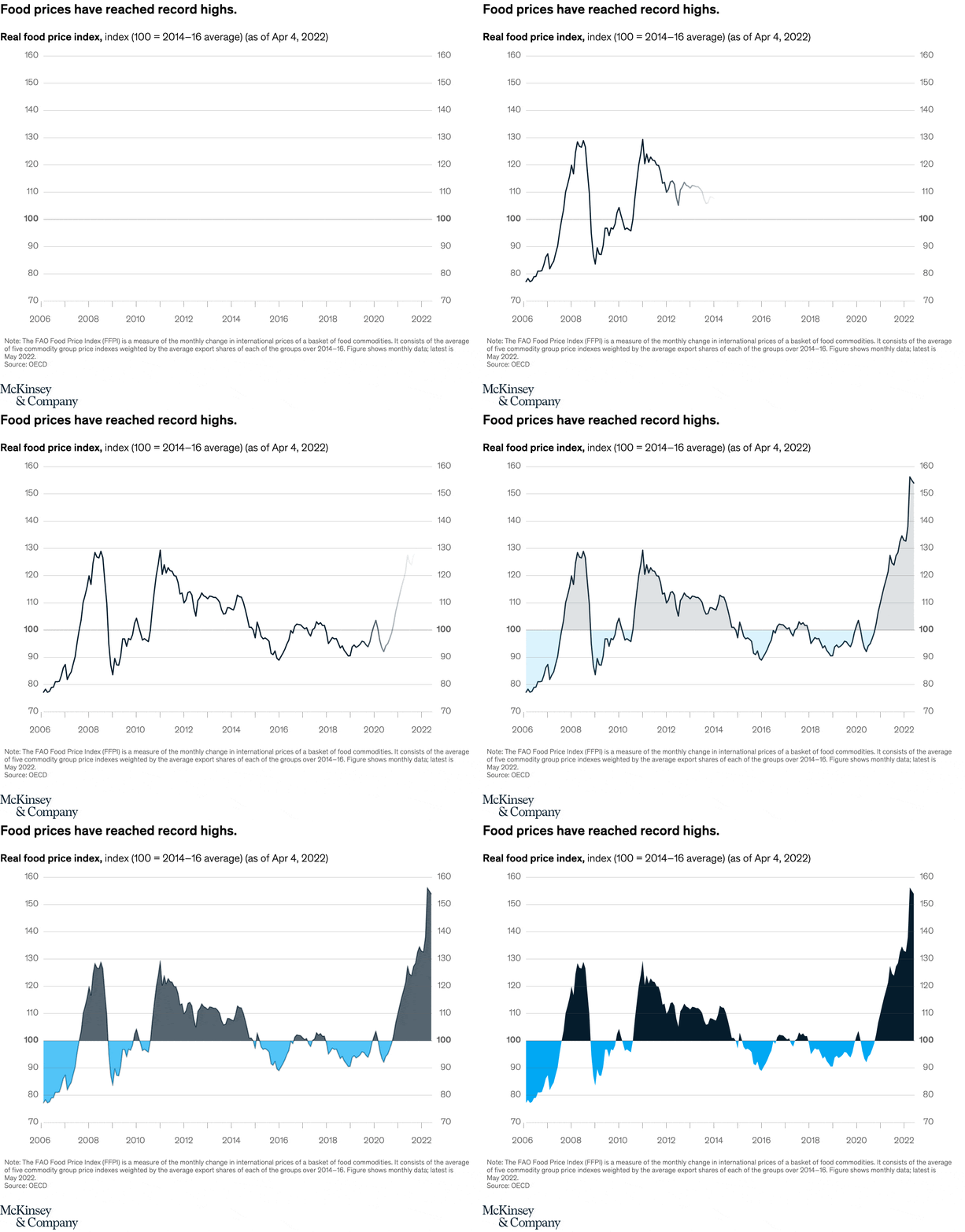
July 19, 2022 – Basic food prices are trending upward as the result of boosted fertilizer costs and other impacts from the conflict in Ukraine. The prices for food commodities now are even higher than they were during price hikes in 2008 and 2011.
To read the article, see “How inflation is flipping the economic script, in seven charts,” July 6, 2022.
customizer here
Visual form
Long-run time-series index chart with area fills.
Layout / body structure
The chart is one continuous chart read left to right from 2006 to 2022. The line traces the food price index through multiple cycles, and the filled areas help separate periods above and below the 100 baseline before the reader drops down to the note.
What is being compared
The chart compares the current food price surge with the earlier spikes around 2008 and 2011. It sets the latest run-up against the longer historical path so the reader can judge whether the present move really is exceptional.
Measurement system
The vertical axis is the real food price index, where 100 equals the 2014 to 2016 average, and the horizontal axis spans 2006 through 2022. The same single scale is used across the entire period, which makes the older peaks and the new one directly comparable.
Visible structure inside the graphic
The line forms three major crests: a sharp peak in 2008, another around 2011, and an even steeper climb into 2022. The filled areas emphasize the stretches above the 100 baseline and make the final run-up look visibly taller and steeper than the earlier episodes.
Main takeaway from the visual
The chart shows that food prices are not just high again; they have pushed beyond the earlier spikes that once defined the cycle. The latest climb breaks above the 2008 and 2011 highs and ends at a new record level.
Key standout values or extremes
The earlier peaks top out around the mid-120s to roughly 130 on the index, while the latest surge rises above 150 by 2022. That new endpoint is the highest visible value on the whole chart and clearly exceeds the previous two crests.
Controls / sequence, when applicable
This is a static chart image with no in-chart controls to operate.
Companion media, when applicable
There is no separate companion audio or video; the chart image is the full visual on this page.