Source page: McKinsey & Company
Commentary
Spread the creativity
Organization | Talent
June 1, 2022 – When designers work within collaborative teams good things tend to happen. According to our research, organizations with cross-functional design integration tend to have better financial performance, happier employees, more evidence of innovation, and stronger environmental, social, and governance (ESG) impact.
To read the report, see “Redesigning the design department,” April 27, 2022.
customizer here
Visual form
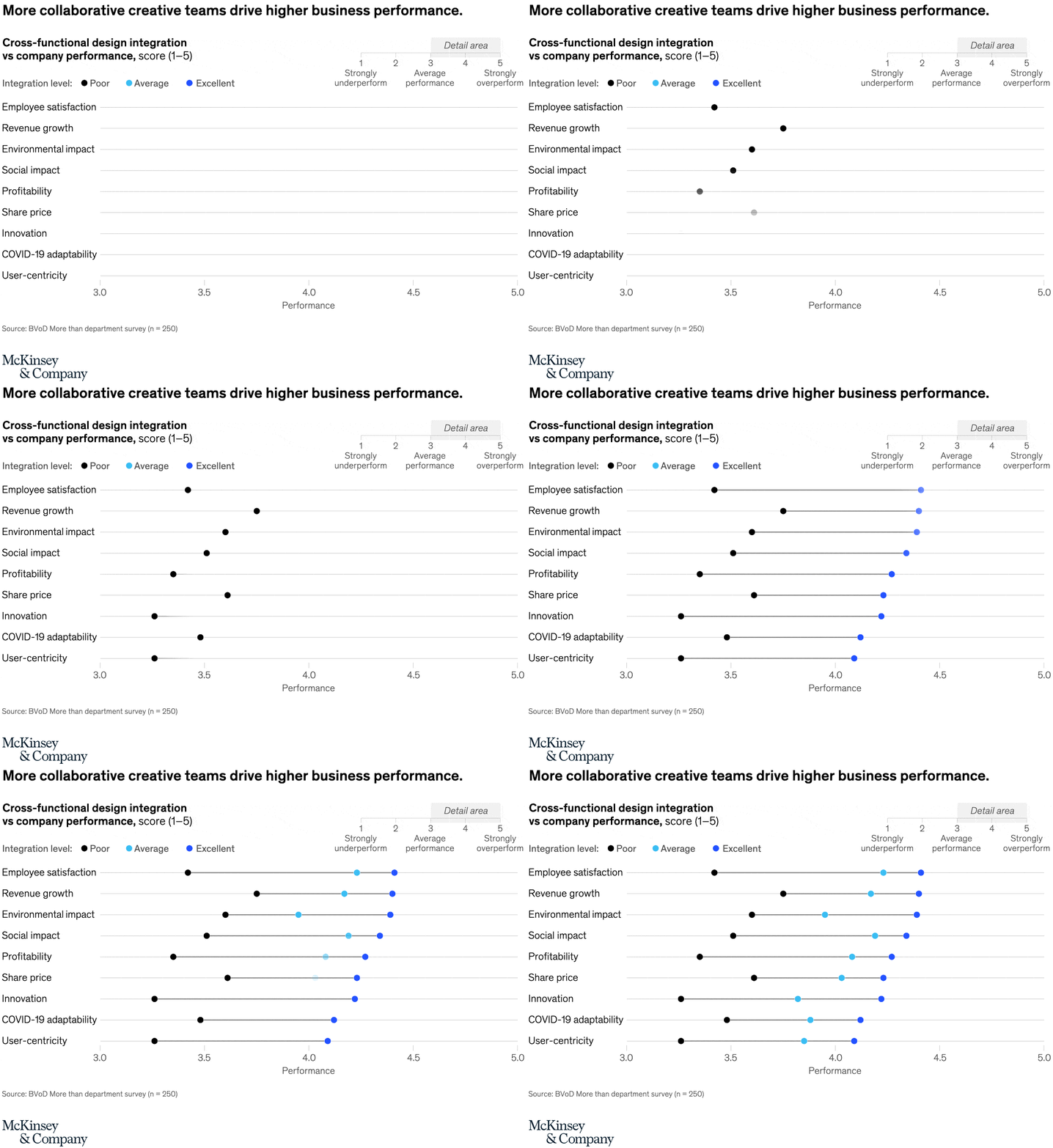
Horizontal three-series dot plot.
Layout / body structure
The chart is a single chart with nine outcome rows stacked from top to bottom on one shared horizontal scale. Read each row left to right from the poor dot to the average dot to the excellent dot, then move down to the next business outcome.
What is being compared
The chart compares company performance across nine outcomes such as employee satisfaction, revenue growth, environmental impact, social impact, profitability, share price, innovation, COVID-19 adaptability, and user-centricity. Each row also compares three levels of cross-functional design integration: poor, average, and excellent.
Measurement system
The measurement is a 1 to 5 performance score, with the right side labeled as stronger business performance and the left side labeled as underperformance. Color distinguishes the three integration levels, with black for poor, cyan for average, and blue for excellent.
Visible structure inside the graphic
Every row contains three dots anchored to the same horizontal axis and linked by a thin line, so the spacing between dots shows the gain from stronger design integration. The repeated row structure makes the graphic read like nine side-by-side rank improvements inside one aligned display.
Main takeaway from the visual
Every row slopes upward from poor to average to excellent, so stronger cross-functional design integration is associated with better results across every outcome shown. The pattern is not confined to one metric: it appears in financial, innovation, people, and ESG rows all at once.
Key standout values or extremes
The highest endpoints sit around the mid-4s for employee satisfaction, revenue growth, environmental impact, and social impact, while the weakest poor-integration scores sit close to the low-3s for innovation and user-centricity. Most average-integration dots cluster around roughly 3.8 to 4.2, while excellent-integration dots cluster around roughly 4.1 to 4.4.
Controls / sequence, when applicable
This is a static chart image with no in-chart controls to operate.
Companion media, when applicable
There is no separate companion audio or video; the chart image is the full visual on this page.