Source page: McKinsey & Company
Commentary
A little help from hybrid
Diversity & Inclusion | Hybrid work
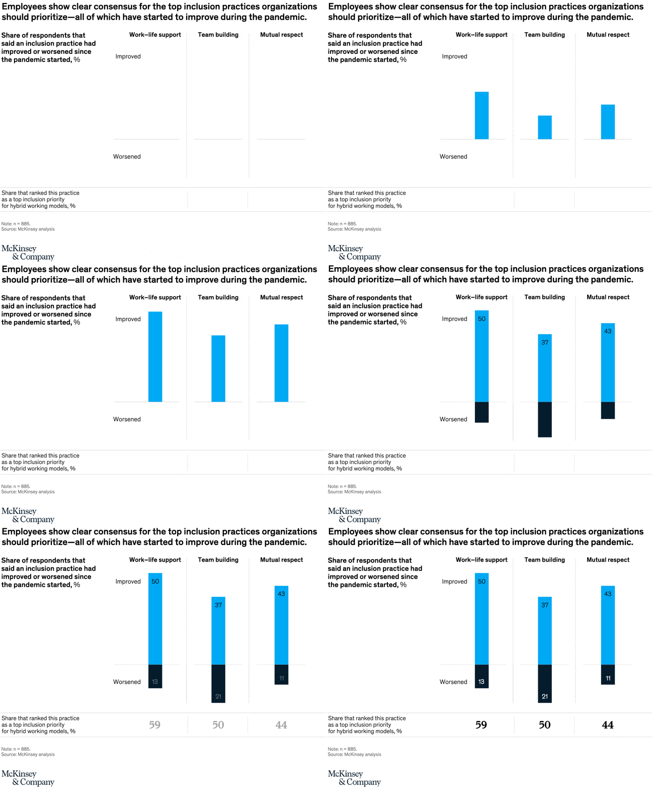
May 19, 2022 – Organizations are still figuring out the best ways to make flexible workplace models meet the needs of their workers, but some benefits are beginning to emerge. Employees responding to a McKinsey survey say inclusion practices such as mutual respect and work–life support have gotten better at their companies thanks to the hybrid work environment.
To read the article, see “Hybrid work: Making it fit with your diversity, equity, and inclusion strategy,” April 20, 2022.
customizer here
Visual form
Three-panel diverging column chart with a priority row.
Layout / body structure
The chart is organized as three adjacent practice columns across the page, with a top section showing what improved or worsened during the pandemic and a bottom strip showing how often each practice is ranked as a top hybrid-work priority. Read left to right across work – life support, team building, and mutual respect, using the top and bottom sections together for each practice before moving to the next one.
What is being compared
The chart compares three inclusion practices at the same time: how respondents say each one changed during the pandemic and how highly each one ranks as a priority for hybrid working models. It is therefore comparing direction of change and strategic importance side by side for the same practices.
Measurement system
The top section measures the percent of respondents who say each practice improved or worsened, with the positive share extending upward and the negative share extending downward. The bottom row measures the share of respondents that rank each practice as a top inclusion priority for hybrid work.
Visible structure inside the graphic
Each practice is represented by one vertical diverging bar split across a central baseline, with blue above the line for improvement and dark below the line for worsening. Direct labels sit inside the bars, and a second numeric row at the bottom adds one bold priority number under each practice, turning the display into a two-level comparison instead of a single bar chart.
Main takeaway from the visual
All three practices show clear net improvement, because the blue improved share is larger than the dark worsened share in every column. Work – life support stands out as the strongest combined signal, with the highest improvement score and the highest priority ranking, while team building improves too but carries the largest worsening share of the three.
Key standout values or extremes
Work – life support shows 50 percent improved and 13 percent worsened, team building shows 37 percent improved and 21 percent worsened, and mutual respect shows 43 percent improved and 11 percent worsened. In the priority row, work – life support ranks first at 59 percent, followed by team building at 50 percent and mutual respect at 44 percent.
Controls / sequence, when applicable
This is a static chart image with no in-chart controls to operate.
Companion media, when applicable
There is no separate companion audio or video; the chart image is the full visual on this page.