Source page: McKinsey & Company
Commentary
Yields sign
Economics | Risk
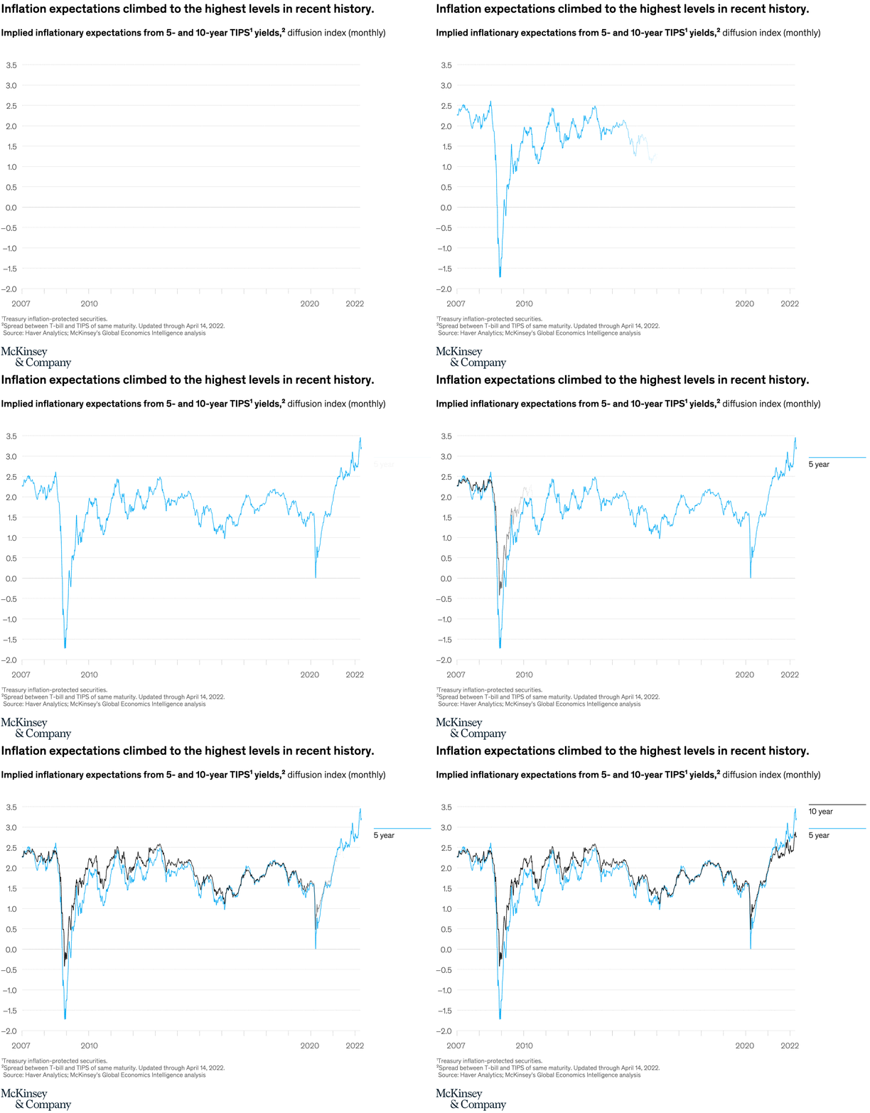
May 13, 2022 – Inflation has accelerated in many economies. According to McKinsey’s Global Economics Intelligence executive summary, inflation expectations in the United States are the highest in recent history (as reflected in the spread between five- and ten-year yields on Treasury bills versus inflation-protected securities).
To read the article, see “Global Economics Intelligence executive summary, April 2022,” May 9, 2022.
customizer here
Visual form
Two-series line chart.
Layout / body structure
The chart is a single time-series panel covering monthly observations from 2007 through 2022. Read left to right across the timeline, tracking the black 10-year line against the blue 5-year line as both move through the same sequence of shocks and recoveries.
What is being compared
The chart compares implied inflation expectations drawn from 5-year and 10-year TIPS-based yield spreads. It is therefore comparing short- to medium-term inflation expectations with longer-term expectations on the same monthly time axis.
Measurement system
The vertical scale is the implied inflation expectation index, and the horizontal scale is calendar time. Color distinguishes the two maturities, with black for the 10-year series and blue for the 5-year series.
Visible structure inside the graphic
Both lines travel closely together for much of the history but separate more visibly during stress points and especially in the final upswing. The graphic has two dramatic downward spikes around the financial-crisis period and the early 2020 shock, followed by a sharp climb into 2021 and 2022 that lifts both lines to the top of the chart.
Main takeaway from the visual
Inflation expectations surge to the highest levels shown anywhere in the time series by the end of the chart. The late rise is broad across both maturities, but the 5-year line climbs higher than the 10-year line, which makes the short-to-medium inflation outlook look especially elevated.
Key standout values or extremes
By the end of the series, the 5-year line rises to a little above 3.2 while the 10-year line is just under 2.8. The deepest trough occurs in the blue 5-year series during the financial-crisis collapse, where it drops to roughly negative 1.7, and both lines also show a sharp but shorter drop during the 2020 shock before rebounding.
Controls / sequence, when applicable
This is a static chart image with no in-chart controls to operate.
Companion media, when applicable
There is no separate companion audio or video; the chart image is the full visual on this page.