Source page: McKinsey & Company
Commentary
Outpatient care without leaving the couch
Healthcare | Technology
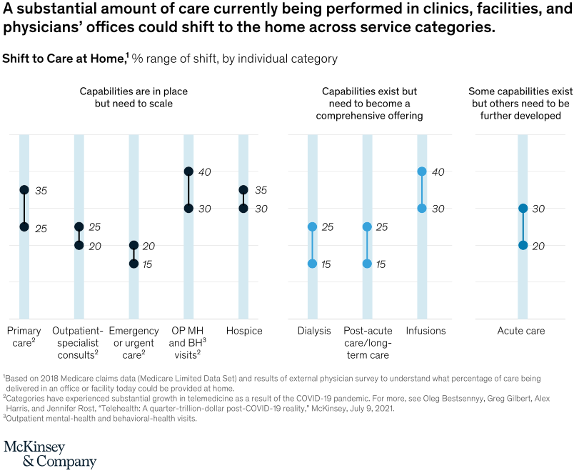
March 3, 2022 – Shifting medical treatment for Medicare beneficiaries from in-person facilities to care at home is possible with the right capabilities in place. An additional 30 to 40 percent of Medicare spending on outpatient behavior- and mental-health visits could be delivered at home, for example. On the lower end, even spending on some urgent care visits could shift to at-home treatment, at 15 to 20 percent, according to a McKinsey survey.
To read the article, see “From facility to home: How healthcare could shift by 2025,” February 1, 2022.
customizer here
Visual form
Category range bar chart.
Layout / body structure
The chart is a single multi-category chart with one vertical range bar per service category. Reader moves left to right across primary care, infusions, outpatient mental and behavioral health, post-acute care, hospice, dialysis, outpatient specialist visits, emergency or urgent care, and acute care, reading the low-to-high shift range in each bar.
What is being compared
The chart compares how much care in different outpatient and post-acute service categories could shift from facilities and offices to the home. It is comparing categories by their potential at-home shift range rather than comparing over time.
Measurement system
The measure is percent range of shift to care at home by individual category. The bars represent low-to-high potential ranges, and the background legend distinguishes between capabilities already in place, capabilities that exist but need to become comprehensive, and capabilities that still need to scale or be developed.
Visible structure inside the graphic
Each service category is shown as a vertical bar spanning a range rather than a single point estimate, and the bars are color-segmented to reflect capability readiness. The repeated range format makes it easy to compare which categories have the broadest and highest home-shift potential and which categories sit lower on the page.
Main takeaway from the visual
A meaningful share of care in several service lines could move into the home, but the opportunity varies sharply by category and by how mature the enabling capabilities are. The tallest ranges sit in the middle-left of the chart, while emergency, urgent, and acute care categories remain visibly lower and more constrained.
Key standout values or extremes
The chart shows ranges reaching about 40 percent for categories such as primary care and infusions, with outpatient mental and behavioral health and post-acute care also sitting high in the 30 to 35 percent range. By contrast, emergency or urgent care and acute care sit lower, around the mid-teens to low-20s, which marks them as the least shiftable categories on the page.
Controls / sequence, when applicable
This is a static chart image with no in-chart controls to operate.
Companion media, when applicable
There is no separate companion audio or video; the chart image is the full visual on this page.