Source page: McKinsey & Company
Commentary
The latest word in industrial efficiency
Operations | Machine Learning
March 2, 2022 – Say, Mr. or Ms. Factory Owner—what would you give to achieve a 10 percent increase in efficiency? What about the potential gains on 20 other metrics we assessed? They’re all possible, with adequate investment in machine intelligence.
To read the article, see “Toward smart production: Machine intelligence in business operations,” February 1, 2022.
customizer here
Visual form
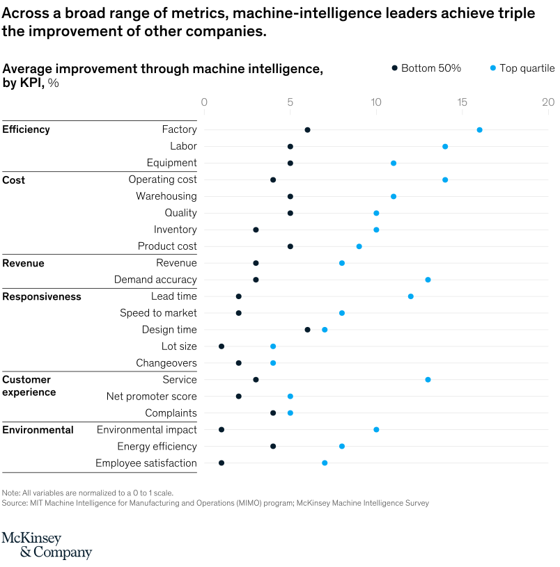
Two-series horizontal KPI comparison chart.
Layout / body structure
The chart is one long list of KPIs arranged vertically and grouped into five sections: efficiency, cost, revenue, customer experience, and environmental performance. Reader moves down the KPI list while comparing the two series plotted across the same horizontal percentage scale at the top.
What is being compared
The chart compares average machine-intelligence improvement by KPI for top-quartile leaders versus the bottom 50 percent of companies. It does this across factory labor, equipment, operating cost, warehousing, quality, inventory, product cost, revenue, demand accuracy, lead time, speed to market, design time, lot size, changeovers, net promoter score, complaints, environmental impact, energy efficiency, and employee satisfaction.
Measurement system
The horizontal scale is percentage improvement by KPI, with visible anchors at 10, 15, and 20. The note states that all variables are normalized to a 0 to 1 scale before comparison, so the chart is focused on relative improvement by metric rather than raw operational units.
Visible structure inside the graphic
Each KPI row carries a bottom-50 value and a top-quartile value on the same horizontal baseline, so the page reads as a repeated side-by-side performance gap down the full KPI list. The category headers down the left margin break the chart into operational families and keep the long list from reading as one undifferentiated block.
Main takeaway from the visual
The top-quartile machine-intelligence leaders outperform the bottom half across almost every metric family on the page, and the size of the gap is repeatedly wide rather than isolated to one KPI. That repeated rightward separation is what makes the chart feel like a broad-based performance lead instead of a one-metric win.
Key standout values or extremes
The headline frames the chart around leaders achieving roughly triple the improvement of other companies across the KPI set. The visible scale topping out around 20 percent shows that many leader readings extend toward the high end of the chart, while the bottom-50 comparisons sit materially shorter across the same rows.
Controls / sequence, when applicable
This is a static chart image with no in-chart controls to operate.
Companion media, when applicable
There is no separate companion audio or video; the chart image is the full visual on this page.