Source page: McKinsey & Company
Commentary
Bailing for better benefits
Healthcare | North America | Diversity & Inclusion
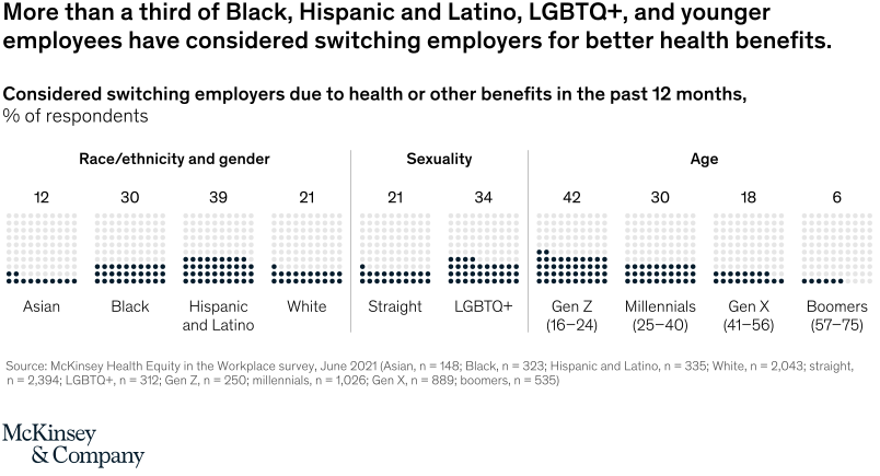
January 20, 2022 – In our survey of nearly 3,000 US workers, 30 percent or more of Black, Hispanic and Latino, LGBTQ+, and younger employees said they had considered switching employers to get better benefits—even when they had access to the same benefits as other colleagues. Further, employees who reported not receiving the care they needed were two times more likely to consider switching employers and half as likely to recommend their employer to friends.
To read the article, see “Income alone may be insufficient: How employers can help advance health equity in the workplace,” December 3, 2021.
customizer here
Visual form
Dot-matrix comparison chart.
Layout / body structure
The chart is a single row of small 10-by-10 dot grids grouped into three labeled sections: race or ethnicity and gender, sexuality, and age. Reader moves left to right across the categories, reading the percentage label above each dot grid and the group name below it together.
What is being compared
The chart compares the share of respondents who considered switching employers in the past 12 months because of health or other benefits. It compares that response across race and ethnicity, sexuality, and age cohorts.
Measurement system
Each mini-grid acts like a 100-dot icon array, so the printed percentage matches the number of dark filled dots within the grid. The measure is percent of respondents, and the labels above the grids provide the exact values for each group.
Visible structure inside the graphic
The visual presents one dot matrix each for Asian, Black, Hispanic and Latino, White, Straight, LGBTQ+, Gen Z, Millennials, Gen X, and Boomers. The dark filled dots cluster low for groups such as Boomers and Asian respondents and much higher for Gen Z, Hispanic and Latino respondents, and LGBTQ+ respondents.
Main takeaway from the visual
The chart makes benefit-driven job-switching pressure look concentrated among younger workers and several underrepresented groups. The denser dot matrices for Gen Z, Hispanic and Latino, Black, and LGBTQ+ respondents sit visibly above the lighter patterns for White, Gen X, and Boomers.
Key standout values or extremes
Gen Z is the highest group at 42 percent, followed by Hispanic and Latino respondents at 39 percent and LGBTQ+ respondents at 34 percent. Black respondents are at 30 percent, Millennials at 30 percent, White and Straight respondents at 21 percent, Asian respondents at 12 percent, Gen X at 18 percent, and Boomers are lowest at 6 percent.
Controls / sequence, when applicable
This is a static chart image with no in-chart controls to operate.
Companion media, when applicable
There is no separate companion audio or video; the chart image is the full visual on this page.