Source page: McKinsey & Company
Commentary
In semiconductors, the strong are getting stronger
Semiconductors | Supply Chain Management
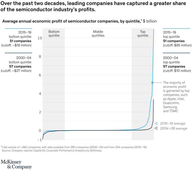
November 19, 2021 – Microchip makers leading the industry widened the profit gap between themselves and laggards to a staggering 400 percent over the past two decades. These companies were able to take advantage of their scale and diverse customer bases and grab large shares of the industry’s profits.
To read the article, see “Value creation: How can the semiconductor industry keep outperforming?,” October 15, 2021.
customizer here
Visual form
Two-line ranked profit-distribution chart.
Layout / body structure
The chart is a single wide ranking plot with two overlaid lines, one for 2004 to 2008 and one for 2015 to 2019, running left to right from the bottom quintile through the middle quintiles to the top quintile. Side annotations frame the bottom and top quintile cutoffs, while the central plot shows how economic profit is distributed across companies.
What is being compared
The chart compares average annual economic profit of semiconductor companies across two periods and across the ranked distribution of firms. It is contrasting how much of the industry’s profits are captured by lower-ranked, middle-ranked, and top-quintile companies in the earlier versus later period.
Measurement system
The vertical axis is measured in billions of dollars of economic profit, ranging from about negative 1 up to just above 10. The horizontal structure is ordinal rather than time-based, grouping companies by their ranked position from bottom quintile to top quintile, with side labels giving the company counts and cutoff values for the bottom and top quintiles in each period.
Visible structure inside the graphic
A black line for 2004 to 2008 and a bright blue line for 2015 to 2019 both stay near zero through most of the middle of the distribution, dip slightly negative on the far left, and then surge sharply upward at the right edge inside the top-quintile band. The visual includes a callout near the upper-right spike noting that the majority of economic profit is garnered by top companies such as Apple, Intel, Qualcomm, Samsung, and TSMC.
Main takeaway from the visual
Profit concentration at the top of the semiconductor industry has intensified over time. The later blue line stays above the earlier black line and rises much more steeply at the extreme right, showing that top companies captured a larger share of the industry’s profits in the more recent period.
Key standout values or extremes
The most dramatic visual extreme is the 2015 to 2019 blue line rising to roughly 11 billion dollars at the far right of the top quintile, compared with a much lower peak for the earlier black line. The top-quintile cutoff also moves from about 10 million dollars in 2000 to 2004 to about 85 million dollars in 2015 to 2019, while the bottom-quintile cutoff becomes less negative, moving from about negative 27 million to negative 18 million.
Controls / sequence, when applicable
This is a static chart image with no in-chart controls to operate.
Companion media, when applicable
There is no separate companion audio or video; the chart image is the full visual on this page.