Source page: McKinsey & Company
Commentary
Not sustainable, not inclusive
North America | Economy
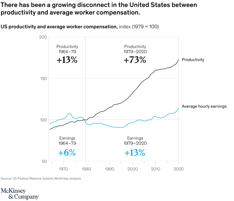
November 16, 2021 – US wages have flatlined since 1979; labor’s share of national income has also declined. Meantime economic productivity has risen steadily. The two measures, which were tightly connected decades ago, are now on different tracks.
To read the article, see “A sustainable, inclusive, and growing future for the United States,” November 8, 2021.
customizer here
Visual form
Two-line index chart.
Layout / body structure
The chart is a single time-series panel running from the late 1960s to 2020, with one dark line for productivity and one blue line for average hourly earnings. A vertical divider at about 1979 splits the page into two eras and anchors the before-and-after percentage callouts printed inside the chart.
What is being compared
The chart compares US productivity with average worker compensation over time. It is showing how the two indexed series move together in the earlier period and then diverge sharply after the late 1970s.
Measurement system
Both lines are indexed to 1979 equals 100, so the reader is tracking relative change rather than raw dollars or output units. The chart also prints era summaries inside the plot: productivity up 13 percent and earnings up 6 percent in 1964 to 1979, then productivity up 73 percent and earnings up 13 percent in 1979 to 2020.
Visible structure inside the graphic
The dark productivity line rises steadily across the whole chart and accelerates after 2000, ending near the mid-170s. The blue earnings line hovers close to the 100 level for most of the post-1979 period, dipping in the 1980s and 1990s before recovering only modestly by 2020, which leaves a wide vertical gap between the two lines on the right side of the panel.
Main takeaway from the visual
Productivity and worker compensation have broken apart over the past four decades. The earlier section shows only a modest gap between the two series, while the post-1979 section opens into a large and persistent spread with productivity climbing much faster than earnings.
Key standout values or extremes
The strongest anchors are the printed growth figures: productivity rises 73 percent from 1979 to 2020 while earnings rise only 13 percent over the same span. By the end of the chart, productivity sits roughly in the mid-170s on the index while earnings are only a little above 110, making the late-period gap the clearest visual extreme.
Controls / sequence, when applicable
This is a static chart image with no in-chart controls to operate.
Companion media, when applicable
There is no separate companion audio or video; the chart image is the full visual on this page.