Source page: McKinsey & Company
Commentary
Machines need ‘on the job training’ too
Technology
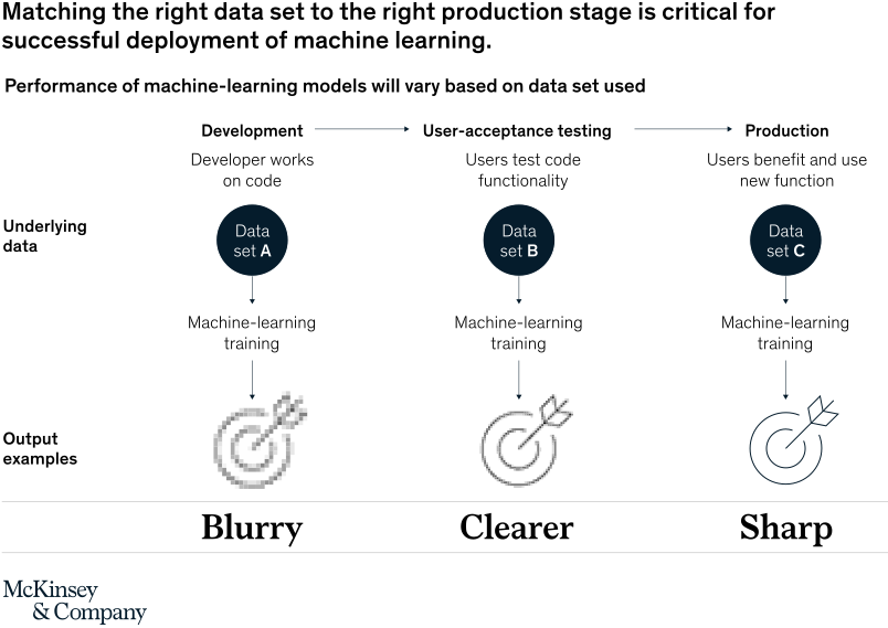
October 13, 2021 – Operationalizing machine learning depends on a solid data set that the underlying algorithms can analyze and learn from. To get there, deployments span three sequential environments to train ML models: development, user-acceptance testing, and production. The production environment is generally optimal because it uses real-world data.
To read the article, see “Operationalizing machine learning in processes,” September 27, 2021.
customizer here
Visual form
Three-stage process diagram with output examples.
Layout / body structure
The chart runs left to right through three columns labeled Development, User-acceptance testing, and Production. Each column repeats the same vertical stack of stage label, underlying data set, machine-learning training step, and output example, so the reader follows the workflow in sequence from the first stage to the last.
What is being compared
The diagram compares three different data sets aligned to three production stages and shows how that alignment affects the quality of the resulting model output. It is a stage-versus-data-match comparison rather than a numeric performance chart.
Measurement system
There is no numeric axis on this chart. The measurement is qualitative and is conveyed by ordered workflow stages and by the output examples changing from blurry to clearer to sharp.
Visible structure inside the graphic
Three arrows across the top connect the stages, each stage contains a dark circular data-set marker labeled A, B, or C, and a downward arrow leads into a machine-learning training step and then into a target-style output example. The bottom row makes the quality progression explicit with the words Blurry, Clearer, and Sharp.
Main takeaway from the visual
The diagram shows that machine learning performs better when the training data matches the actual production stage where the model will be used. The page makes the improvement visible by tightening the output image as the workflow moves from development-stage data to production-stage data.
Key standout values or extremes
The strongest visual extremes are the two endpoints: Data set A in development produces the blurriest target, while Data set C in production produces the sharpest one. The middle UAT column sits between those extremes and serves as the bridge from a fuzzy training result to a production-ready output.
Controls / sequence, when applicable
This is a static chart image with no in-chart controls to operate.
Companion media, when applicable
There is no separate companion audio or video; the chart image is the full visual on this page.