Source page: McKinsey & Company
Commentary
Short sprints for big reductions
Agile | Digital | Technology
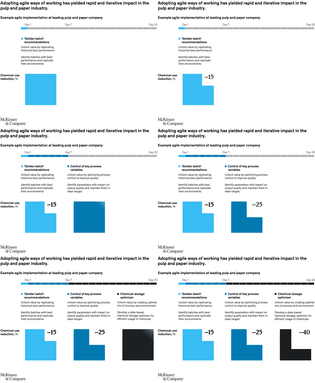
September 22, 2021 – Shifting to agile ways of working could be a boon for manufacturing. One paper production company using short sprints across multidisciplinary teams saw improved efficiency and reductions in chemical use in less than a month.
To read the article, see “Tapping digital’s full potential in pulp and paper process optimization,” August 24, 2021.
customizer here
Visual form
Animated process-timeline infographic.
Layout / body structure
The visual is organized around a horizontal day-by-day timeline running from Day 1 to Day 20 across the top, with explanatory text and a highlighted recommendation block below it. The animation walks the reader through the sprint sequence while tying the process steps to the chemical-use-reduction result shown in the lower portion of the frame.
What is being compared
The chart compares elapsed implementation time during an agile sprint with the operational result it unlocks for a pulp-and-paper company. It links a specific recommendation stream, labeled as ‘Golden batch’ recommendations, to the resulting chemical-use reduction outcome.
Measurement system
Time is measured in days along the top timeline, with Day 1, Day 7, and Day 20 called out as anchors. The business outcome is framed as chemical-use reduction in percent, although the animated graphic emphasizes the reduction visually rather than printing a single large numeric value in the captured frame.
Visible structure inside the graphic
A segmented progress bar stretches across the top, one segment per day, while the center-left text block explains the recommendation theme and the lower-left graphic area visualizes the reduction outcome. The animation format makes the chart read like a timed rollout rather than a conventional static chart.
Main takeaway from the visual
The page shows that agile ways of working can produce visible operating gains in a short window, with the sprint structure itself presented as the mechanism that turns recommendations into rapid chemical-use reductions.
Key standout values or extremes
The strongest anchors on the graphic are the Day 1, Day 7, and Day 20 markers across the top, which compress the whole improvement cycle into less than three weeks. The outcome section emphasizes that the payoff is large enough to warrant a full highlighted result block even though the captured frame does not print one dominant percentage label.
Controls / sequence, when applicable
This is a static chart image with no in-chart controls to operate.
Companion media, when applicable
There is no separate companion audio or video; the chart image is the full visual on this page.