Source page: McKinsey & Company
Commentary
Everyone’s a critic
Mobility | Travel & Transportation
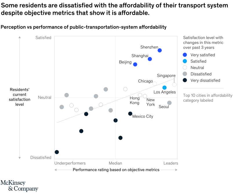
September 21, 2021 – Well, not everyone. We tracked residents’ satisfaction with transport systems and their affordability. People seem to appreciate the investment their cities have made, but in a few cases, their perceptions may not be aligned with reality. Most citizens feel that public transport is too expensive in their cities. Seoulites, for example, are dissatisfied despite their city’s highly affordable transport system.
To read the article, see “Building a transport system that works: Five insights from our 25-city report,” August 11, 2021.
customizer here
Visual form
Perception-versus-performance scatter plot.
Layout / body structure
The chart uses one square matrix with objective performance running left to right and resident satisfaction running bottom to top, plus a legend column on the right. Reader first places cities within the underperformers, median, and leaders regions on the horizontal axis and then checks whether their vertical position and dot color reflect satisfaction or dissatisfaction.
What is being compared
The chart compares public-transport affordability as measured by objective performance metrics against residents’ current satisfaction with that affordability. It also layers in how satisfied residents are with changes in the metric over the past three years through the dot colors.
Measurement system
The horizontal axis is a categorical performance scale moving from underperformers to leaders, while the vertical axis is a categorical satisfaction scale moving from dissatisfied through neutral to satisfied. Dot color adds a second satisfaction measure, ranging from very satisfied to very dissatisfied with recent change.
Visible structure inside the graphic
Each city is plotted as a labeled dot inside the matrix, and the top 10 cities in the affordability category are named directly on the chart. A dotted trend line slopes upward across the field, while the right-side legend explains the five dot-color states used for satisfaction with changes over the past three years.
Main takeaway from the visual
The matrix shows that strong objective affordability does not always produce equally strong resident sentiment. Some cities cluster in the leader zone while still sitting only near neutral or even dissatisfied satisfaction levels, which is why the chart frames the problem as a perception-performance disconnect.
Key standout values or extremes
Shenzhen, Shanghai, and Beijing sit in the leader area high on the satisfaction scale, making them the strongest positive cases on the page. Singapore and Los Angeles also land in the leader zone but sit much closer to neutral, while Seoul appears as a leader with a dissatisfied reading and Mexico City sits lower in satisfaction despite being closer to the median-performance area.
Controls / sequence, when applicable
This is a static chart image with no in-chart controls to operate.
Companion media, when applicable
There is no separate companion audio or video; the chart image is the full visual on this page.