Source page: McKinsey & Company
Commentary
Inflation comes back to life
North America | Economy
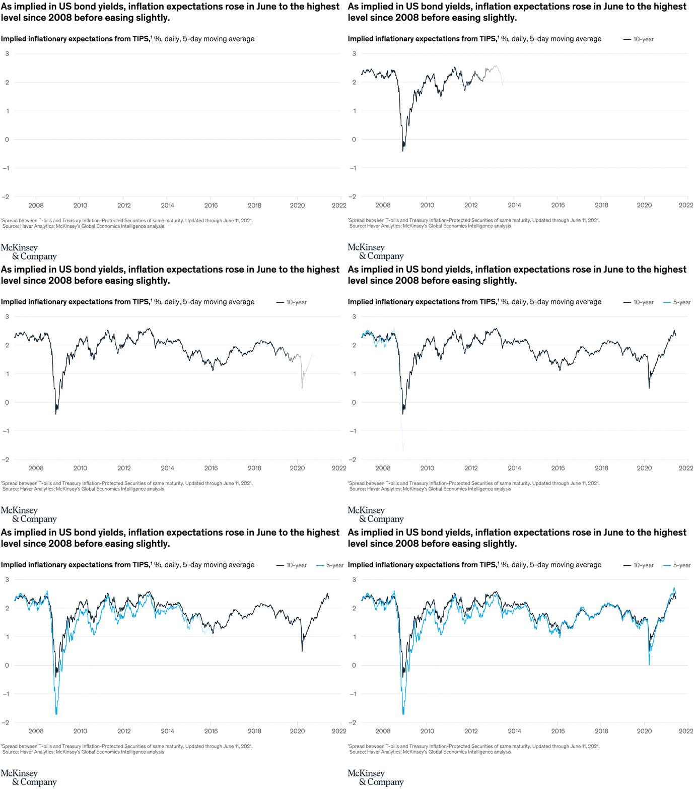
August 13, 2021 – As the global economy emerges from the worst of the pandemic, strong growth is back—and so is inflation. Higher commodity prices are creating stress in all economies, developed and emerging. Oil prices reached $75 per barrel due to rising demand. Food-price inflation reached its highest level since 2011. In the United States, consumer inflation reached 5% in May. US investors are factoring all this into their expectations.
To read the article, see “Global Economics Intelligence executive summary, June 2021,” July 19, 2021.
customizer here
Visual form
Two-line time-series chart.
Layout / body structure
The chart is a single chart with both lines running across the full page from 2007 into 2021. Read left to right through the major swings in the two series, using the legend at the upper right to distinguish the 10-year line from the 5-year line.
What is being compared
The chart compares implied inflation expectations from TIPS for two maturities: 10-year and 5-year. It is comparing both the level of inflation expectations and the way the shorter- and longer-term series move together through crises and recoveries.
Measurement system
The vertical scale measures implied inflation expectations in percent, shown as a daily five-day moving average. The black line represents the 10-year series and the blue line represents the 5-year series.
Visible structure inside the graphic
Two closely tracking lines run across the same time axis, with occasional separation where short-term expectations swing more sharply. The chart includes a bold headline, a simple two-item legend, and a long horizontal timeline covering the financial crisis, the mid-2010s, the pandemic shock, and the 2021 rebound.
Main takeaway from the visual
Inflation expectations crashed during the financial crisis, recovered, dipped again around the pandemic, and then rose sharply in 2021 to the strongest level on the chart since 2008 before easing slightly. The 5-year line moves more violently than the 10-year line, but both finish the period near local highs.
Key standout values or extremes
The deepest trough arrives around the 2008 to 2009 crisis, where the 5-year series drops well below negative 1.5 percent and the 10-year line briefly falls slightly below zero. By 2021 both lines climb back into the mid-2 percent range, with the 5-year line peaking a bit above the 10-year line near the top of the chart.
Controls / sequence, when applicable
This is a static chart image with no in-chart controls to operate.
Companion media, when applicable
There is no separate companion audio or video; the chart image is the full visual on this page.