Source page: McKinsey & Company
Commentary
The Tokyo Olympics: One thing that can’t be automated
Asia-Pacific | Future of Work
July 21, 2021 – The eyes of the world are locked on Tokyo for the 2020 (or, if you prefer, 2021) Summer Olympics. Our research reveals that Japan has more jobs at risk of automation than any other country. Pole vaulters and tennis players are safe, for now. But many other job categories are vulnerable.
To read the article, see “The future of work in Japan: Accelerating automation after COVID-19,” July 1, 2020.
customizer here
Visual form
Bubble scatter plot with labeled country points.
Layout / body structure
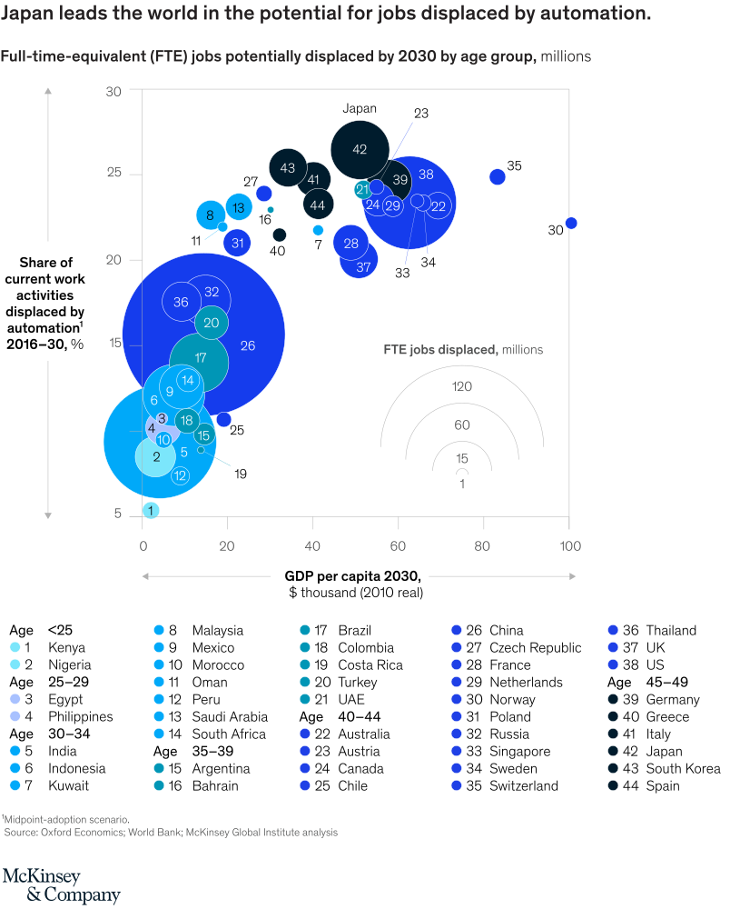
The chart is a single scatter plot read across GDP per capita on the horizontal axis and upward by share of work activities displaced on the vertical axis. After locating the main clusters, use the bubble sizes and country labels to compare how many full-time-equivalent jobs could be displaced by 2030.
What is being compared
The chart compares countries on three dimensions at once: GDP per capita in 2030, the share of current work activities displaced by automation from 2016 to 2030, and the total number of full-time-equivalent jobs displaced by 2030. It also groups countries by age cohort through color.
Measurement system
The horizontal axis is GDP per capita in 2030 in thousands of 2010 dollars, the vertical axis is the share of work activities displaced in percent, and bubble area represents FTE jobs displaced in millions. Colors indicate age group clusters, and the numbered labels map to country names in the key below the chart.
Visible structure inside the graphic
The main field contains dozens of labeled bubbles with a separate bubble-size key in the lower right. A text callout points to Japan near the upper middle of the chart, and a large legend below the plot maps the point numbers to countries grouped by age categories.
Main takeaway from the visual
Japan stands out because it combines one of the highest projected shares of work displaced with a large number of jobs affected, despite not being at the absolute far right of GDP per capita. The chart also shows that displacement is not only a rich-country story: some lower-income countries have large bubbles because their labor forces are large even when their GDP per capita is low.
Key standout values or extremes
Japan is called out around 23 million displaced jobs and roughly 27 percent of work activities displaced. The largest bubble on the chart sits among lower-to-middle GDP-per-capita countries and signals over 100 million displaced jobs, while the size legend marks reference levels of 1, 15, 60, and 120 million. Several high-income countries such as Norway and Switzerland sit far to the right on GDP per capita but with smaller bubbles than the biggest large-labor-force countries.
Controls / sequence, when applicable
This is a static chart image with no in-chart controls to operate.
Companion media, when applicable
There is no separate companion audio or video; the chart image is the full visual on this page.