Source page: McKinsey & Company
Commentary
Digital healthcare: All talk, (mostly) no action
Digital | Healthcare
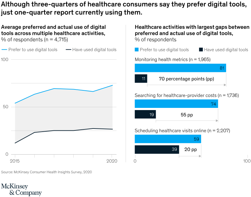
July 19, 2021 – While a majority of healthcare consumers say they prefer digital tools across all healthcare-related activities, the percentage of consumers who actually use digital tools remains low. Some of the largest opportunities to increase digital use include monitoring health metrics, searching for healthcare-provider costs, and scheduling appointments online.
To read the article, see, “How COVID-19 has changed the way US consumers think about healthcare,” June 4, 2021.
customizer here
Visual form
Two-panel chart combining a line chart and a horizontal bar comparison.
Layout / body structure
The chart is split into two side-by-side panels. Reader scans the left panel first to follow preference and usage lines across 2015 to 2020, then moves right to three stacked category rows that compare preferred versus actual use for the largest-gap healthcare activities.
What is being compared
The chart compares preferred use of digital healthcare tools against actual use overall over time, and then compares the same two measures across monitoring health metrics, searching for provider costs, and scheduling healthcare visits online.
Measurement system
The measurement is percent of respondents. The left panel tracks two lines on a 0 to 100 percent scale, and the right panel uses paired horizontal bars plus labeled gap arrows, with values such as 81 versus 11, 74 versus 19, and 59 versus 39 called out directly.
Visible structure inside the graphic
On the left, a bright blue preference line and a dark usage line run across a gray plot area with year marks from 2015 to 2020. On the right, each activity gets a blue preference bar above a dark usage bar, and a thin arrowed bracket between them marks the size of the gap in percentage points.
Main takeaway from the visual
Preference for digital healthcare tools sits well above actual use throughout the period and stays visibly separated at every point. The biggest mismatch appears in monitoring health metrics, while scheduling visits online shows the narrowest gap of the three featured activities.
Key standout values or extremes
The right panel makes the extremes explicit: monitoring health metrics shows an 81 percent preference rate versus 11 percent actual use for a 70-point gap, searching provider costs shows 74 versus 19 for a 55-point gap, and scheduling visits online shows 59 versus 39 for a 20-point gap.
Controls / sequence, when applicable
This is a static chart image with no in-chart controls to operate.
Companion media, when applicable
There is no separate companion audio or video; the chart image is the full visual on this page.