Source page: McKinsey & Company
Commentary
A sure thing?
COVID-19 | Economy
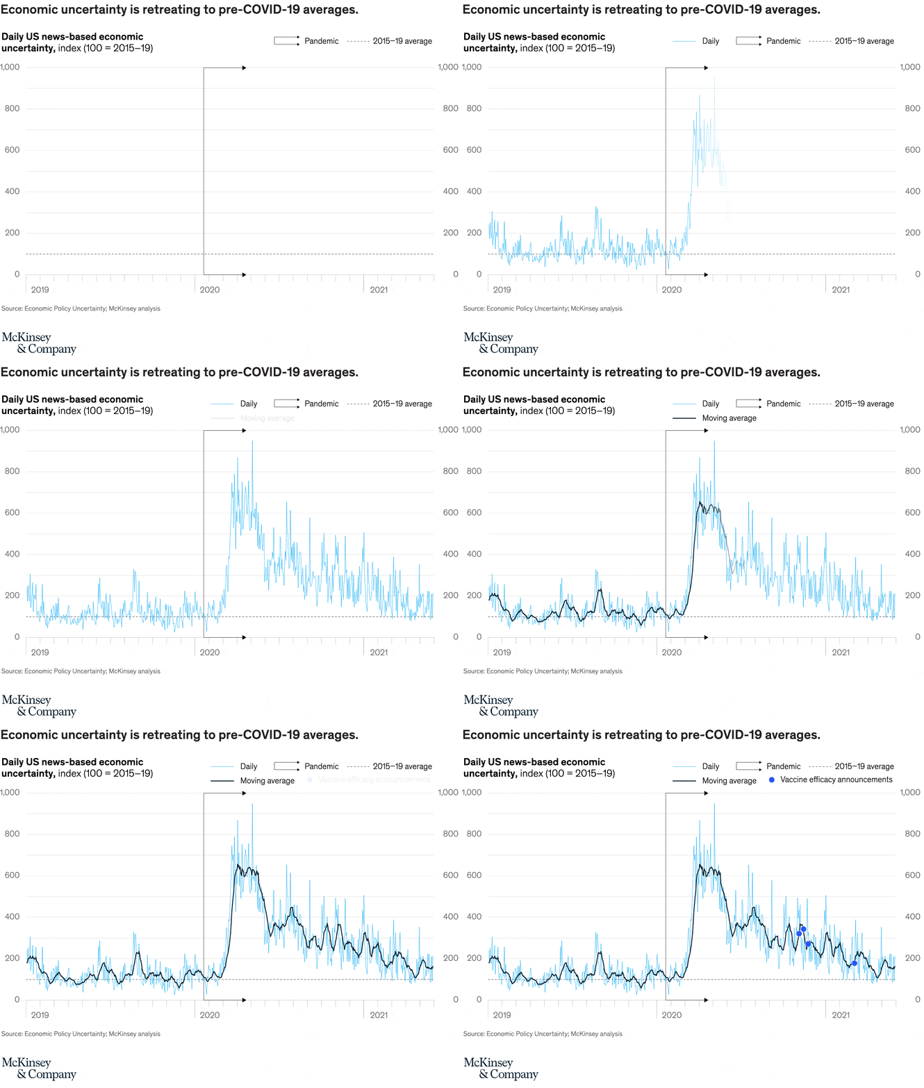
July 14, 2021 – With US vaccine rates and employment levels rising, economic uncertainty has fallen sharply and lost the paralyzing grip it held in the early part of the pandemic.
To read the article, see “Looking beyond the pandemic: Could the world economy gain more than it lost to COVID-19?”, June 14, 2021.
customizer here
Visual form
Time-series line chart.
Layout / body structure
The chart is a single full-width chart with one plotting area and notes below. Reader moves left to right across 2019 to 2021, following the light daily series, the darker moving average, the dashed long-run baseline, and then the blue event dots near the right half of the chart.
What is being compared
The chart compares daily US news-based economic uncertainty with its moving average over time, while also marking the pandemic period and vaccine efficacy announcements against the same timeline.
Measurement system
The measurement is an uncertainty index with 100 set to the 2015 to 2019 average. The vertical scale runs from 0 to 1,000, the dashed line marks the pre-COVID average, and the two line styles separate the daily reading from the smoother moving average.
Visible structure inside the graphic
A thin light-blue line shows jagged day-to-day swings, a darker black line smooths that movement into the moving average, and a dashed horizontal baseline sits near the bottom as the pre-COVID reference. A vertical divider and arrowed labels mark the pandemic period, and blue dots on the declining right half mark vaccine efficacy announcements.
Main takeaway from the visual
Uncertainty explodes upward at the start of the pandemic and then spends the rest of the chart stepping back down toward its earlier norm. By the far right, the moving average sits much closer to the old baseline than to the early-2020 spike, which makes the retreat visually unmistakable.
Key standout values or extremes
The tallest daily spikes reach close to 900, and the moving average peaks a little above 600 in early pandemic months before sliding back toward roughly the mid-100s by 2021. The reference level of 100 is far below the peak but much closer to the chart’s ending range than to its crisis high.
Controls / sequence, when applicable
This is a static chart image with no in-chart controls to operate.
Companion media, when applicable
There is no separate companion audio or video; the chart image is the full visual on this page.