Source page: McKinsey & Company
Commentary
One way to lift GDP substantially
Financial services | Economic Development
July 8, 2021 – Checks, ATM withdrawals, insurance payments—financial data take many forms. Countries that embrace open systems to share the data could lift GDP substantially. New McKinsey Global Institute research identified seven ways that consumers and financial firms would benefit, ranging from better access to credit for more customers to efficiencies for banks.
To read the article, see “Financial data unbound: The value of open data for individuals and institutions,” June 24, 2021.
customizer here
Visual form
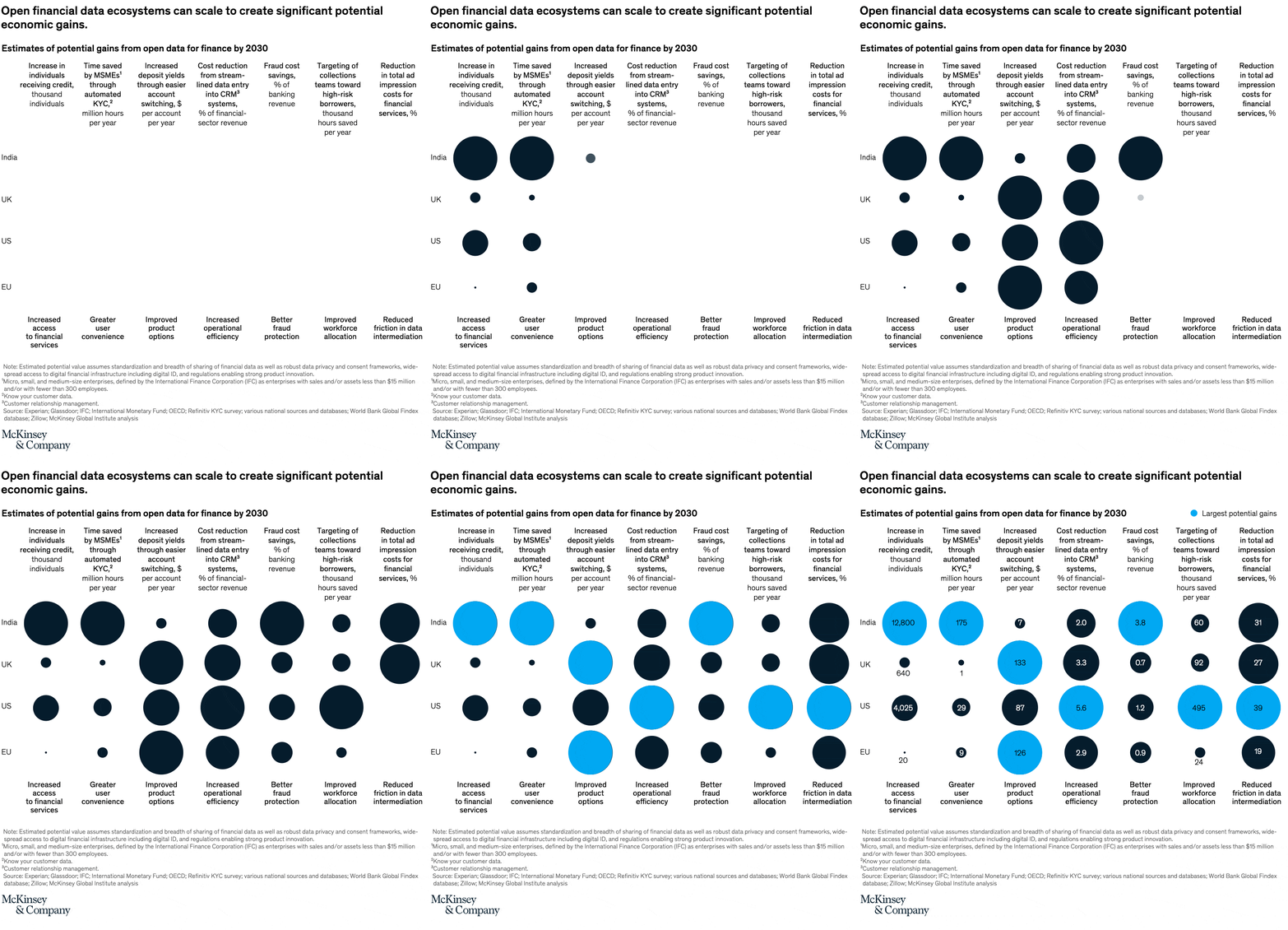
Bubble matrix chart.
Layout / body structure
The chart is a single comparison grid read by columns and rows. Reader moves across seven benefit columns, then down the region rows for India, UK, US, and EU, using bubble size and color to compare which region has the largest potential gain in each category; explanatory notes sit below the matrix.
What is being compared
The chart compares estimates of potential gains from open financial data by 2030 across four regions and seven outcome categories, including access to financial services, user convenience, product options, operational efficiency, fraud protection, workforce allocation, and reduced friction in data intermediation.
Measurement system
Each bubble is labeled with its value in the units named at the top of its column, such as thousand individuals, million hours per year, dollars per account per year, or percent. Bubble size encodes magnitude, and the bright blue fill marks the largest potential gain in that column while the dark fill marks the other regions.
Visible structure inside the graphic
The chart uses a four-row by seven-column bubble field with region labels on the left and outcome labels under each column. Large circles sit directly in the grid cells with the values printed inside or just below them, and a small legend at the top right explains the blue highlight as the largest potential gains.
Main takeaway from the visual
The chart shows that the biggest open-data opportunities are not concentrated in one region alone; different regions dominate different use cases. India visibly leads access-to-credit and MSME time-saved categories, the US leads workforce allocation and operational efficiency, and the UK or EU lead several product and cost categories.
Key standout values or extremes
The largest bubble on the page is India at 12,800 thousand individuals for increased access to financial services. Other prominent highs include US targeting of collections teams at 495 thousand hours saved per year, UK increased deposit yields at 133 dollars per account per year, EU improved product options at 126, and US reduced friction in data intermediation at 39 percent.
Controls / sequence, when applicable
This is a static chart image with no in-chart controls to operate.
Companion media, when applicable
There is no separate companion audio or video; the chart image is the full visual on this page.