Source page: McKinsey & Company
Commentary
Ditching the digital cart for the checkout line
COVID-19 | Economy
June 2, 2021 – Shoppers overwhelmingly took to digital channels with the onset of the pandemic. Now, as the number of COVID-19 cases is declining and lockdowns are lifting in some countries, consumers may be eager to step away from the screen and experience shopping in person again.
To read the article, see “What’s next for digital consumers,” May 23, 2021.
customizer here
Visual form
Three-wave cross-country scatter plot.
Layout / body structure
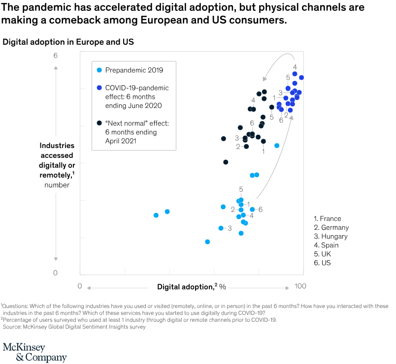
The chart uses one shared scatter field with three differently colored point clouds representing prepandemic 2019, the COVID-19 pandemic effect through June 2020, and the next normal effect through April 2021. Read from the low-left light-blue cluster to the upper-right dark clusters, then use the numbered country labels and curved arrow to see how the center of gravity shifts over time.
What is being compared
The chart compares European and US digital adoption across three time frames while also comparing the number of industries consumers accessed digitally or remotely. Each numbered point represents one country – France, Germany, Hungary, Spain, the UK, or the US – and each time-wave shows where those countries sit on both digital-adoption percentage and number of digitally accessed industries.
Measurement system
The horizontal axis measures digital adoption as a percentage from 0 to 100, and the vertical axis measures the number of industries accessed digitally or remotely from 0 to 6. Color distinguishes the three time periods, so position and color together show how adoption and breadth changed from 2019 to the pandemic peak and then into the next normal.
Visible structure inside the graphic
The prepandemic points form a low-left cluster, the pandemic-effect points shift sharply toward the upper-right, and the next-normal points sit slightly back from the peak cluster while remaining far above 2019. Country numbers are repeated inside each time wave, which lets the reader see how each national point moved through the same diagonal path over time.
Main takeaway from the visual
Digital adoption surged during the pandemic, but some physical-channel recovery has pulled the next-normal cluster slightly back from the pandemic peak rather than pushing it even farther upward. Even so, the next-normal points remain well above the 2019 cluster, so the comeback of physical channels does not erase the structural lift in digital behavior.
Key standout values or extremes
The most important extreme is positional rather than one printed number: the 2019 cluster sits down around the lower half of the field, the pandemic wave rises close to the top-right corner near 80 to 100 percent adoption and roughly four to five digitally accessed industries, and the next-normal points stay near that same zone but a bit lower than the peak. The country labels 1 through 6 repeat across all three waves, making the common upward shift and slight pullback legible for every market on the page.
Controls / sequence, when applicable
This is a static chart image with no in-chart controls to operate.
Companion media, when applicable
There is no separate companion audio or video; the chart image is the full visual on this page.