Source page: McKinsey & Company
Commentary
Companies across sectors are putting a price on emissions
Climate change | Carbon pricing | Sustainability
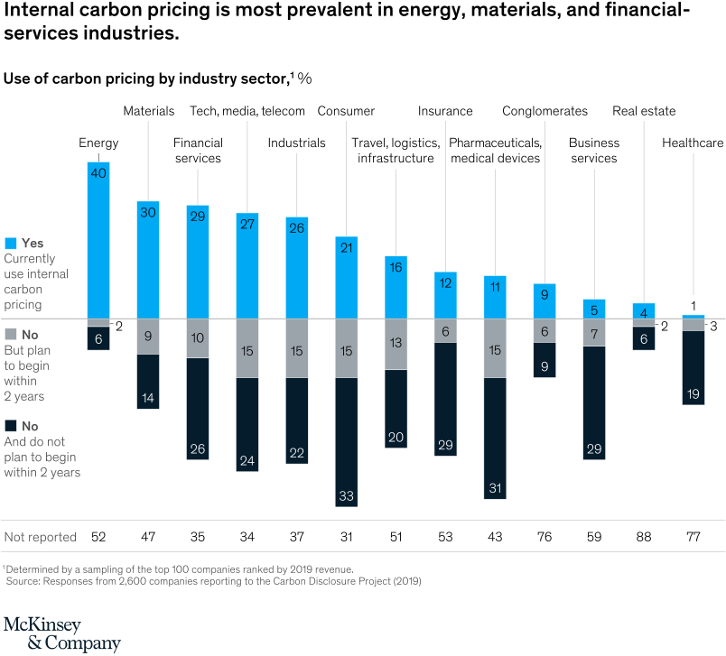
February 23, 2021 – Internal carbon pricing—a charge on carbon dioxide emitted from assets and investment projects—can help companies see how, where, and when their emissions could affect their profit-and-loss (P&L) statements and investment choices. Energy companies are leading the way, naturally, and many other sectors are also engaging.
To read the article, see “The state of internal carbon pricing,” February 10, 2021.
customizer here
Visual form
Diverging stacked-bar industry comparison chart.
Layout / body structure
The chart is one row of industry columns built around a central baseline. Reader moves left to right across sectors, reading the bright bar above the line for current use of internal carbon pricing and the darker blocks below the line for the two non-use responses, while the not-reported count sits underneath each sector.
What is being compared
It compares industry sectors on three response categories: companies that currently use internal carbon pricing, companies that do not use it but plan to begin within two years, and companies that do not use it and do not plan to begin within two years.
Measurement system
The main measure is percent of companies within each industry sector. The blue segment above the baseline shows current use, the gray and dark segments below the baseline show the two non-use positions, and the row at the bottom lists how many responses were not reported for each sector.
Visible structure inside the graphic
Each industry is drawn as a vertical stack split by a shared zero line, so adoption and non-adoption can be compared in one glance. The chart keeps the same color order for every sector, which makes the strongest-adoption industries pop on the left and the weakest-adoption industries stand out on the right.
Main takeaway from the visual
Internal carbon pricing is concentrated in a few sectors rather than evenly adopted across the economy. Energy, materials, and financial services sit well above the rest, while healthcare, real estate, and business services show very limited current use.
Key standout values or extremes
Energy leads with 40 percent currently using internal carbon pricing, followed by materials at 30 percent, financial services at 29 percent, tech or media or telecom at 27 percent, and industrials at 26 percent. At the low end, healthcare is only 1 percent, real estate is 4 percent, and business services is 5 percent, while healthcare also shows 19 percent not planning to begin within two years and 77 responses not reported.
Controls / sequence, when applicable
This is a static chart image with no in-chart controls to operate.
Companion media, when applicable
There is no separate companion audio or video; the chart image is the full visual on this page.