Source page: McKinsey & Company
Commentary
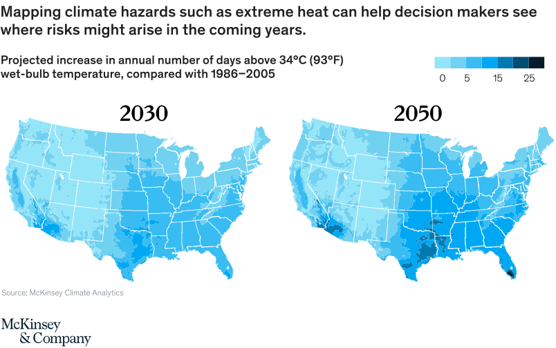
Too darn hot: South Florida could face 25 more days of swelter each year.
Climate change | Sustainability | North America
February 18, 2021 – New information assets could help government, utilities, and infrastructure businesses target investments. A nationwide map indicating present and projected physical climate hazards shows the risk to some parts of the country.
To read the article, see “America 2021: Renewing the nation’s commitment to climate action,” February 18, 2021.
customizer here
Visual form
Two-panel US choropleth map comparison.
Layout / body structure
The chart places a 2030 map on the left and a 2050 map on the right, both using the same national outline and the same color legend. Reader compares the left map first and then the right map to see how the areas of darker heat risk spread over time.
What is being compared
It compares the projected increase in the annual number of days above 34 degrees Celsius or 93 degrees Fahrenheit wet-bulb temperature across the United States in 2030 versus 2050, relative to the 1986 to 2005 baseline.
Measurement system
The measure is additional days above the wet-bulb heat threshold. The legend bins the increase into 0, 5, 15, and 25 plus days, with darker blues indicating larger increases.
Visible structure inside the graphic
Both maps use county-level or sub-state shading inside the same US outline, so the comparison depends on where the darker patches accumulate. The Southeast, Gulf Coast, and South Florida stand out as the darkest areas, while much of the West and upper Midwest stay in lighter shades.
Main takeaway from the visual
Extreme-heat exposure broadens and intensifies between 2030 and 2050. The darker blues spread across more of the South and deepen around the hottest regions, making the future risk look not just higher but more geographically extensive.
Key standout values or extremes
South Florida and parts of the Gulf Coast sit at or near the darkest legend category by 2050, indicating roughly 25 or more additional swelter days per year. Much of the central and southeastern United States moves from light or medium blue in 2030 to darker medium and dark blue in 2050, while large parts of the Mountain West remain near the lowest bins.
Controls / sequence, when applicable
This is a static chart image with no in-chart controls to operate.
Companion media, when applicable
There is no separate companion audio or video; the chart image is the full visual on this page.