Source page: McKinsey & Company
Commentary
US herd immunity: Still on track for 2021, but new variants threaten the timeline
COVID-19 | Public Health | Healthcare
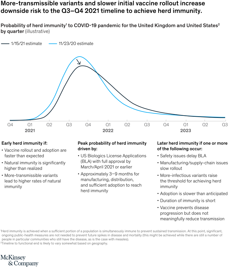
January 25, 2021 – While the probability of achieving herd immunity by fall is still the most likely scenario, the rise of more contagious mutations and slower initial vaccine rollout increase the likelihood that the UK and the US will acquire herd immunity by early 2022.
To read the article, see “When will the COVID-19 pandemic end?,” January 20, 2021.
customizer here
Visual form
Two-scenario probability curve chart.
Layout / body structure
The chart is a single panel with two smooth probability curves running left to right from late 2020 into 2023, and three explanatory text blocks underneath. Read the curves first to compare the timing shift between the two estimates, then use the notes below to interpret what pushes the curve earlier or later.
What is being compared
The chart compares two estimated probability distributions for when herd immunity to COVID-19 might be reached in the United Kingdom and United States. One curve is the earlier November 23, 2020 estimate and the other is the later January 15, 2021 estimate.
Measurement system
The horizontal axis is calendar time by quarter, while the vertical dimension is probability even though no numeric y-axis is shown. The chart uses curve position and peak timing rather than bar heights or printed percentages to express the comparison.
Visible structure inside the graphic
Two bell-like lines sit on the same time axis, with the earlier estimate in blue and the later estimate in dark navy. The blue curve peaks slightly earlier, while the navy curve shifts to the right and stretches farther into later quarters, and the text below is split into three columns for early, peak, and late herd-immunity conditions.
Main takeaway from the visual
The updated estimate pushes the most likely herd-immunity window later and increases downside risk to the late-2021 timeline. The rightward shift and longer tail of the newer dark curve make that delay visible even before reading the explanatory bullets.
Key standout values or extremes
The peak of the earlier curve sits around Q3 2021, while the updated curve peaks closer to Q4 2021 and remains materially present into 2022. The strongest visual contrast is the later tail of the January estimate, which extends farther right than the November estimate.
Controls / sequence, when applicable
This is a static chart image with no in-chart controls to operate.
Companion media, when applicable
There is no separate companion audio or video; the chart image is the full visual on this page.