Source page: McKinsey & Company
Commentary
China's executives: The world's most optimistic during the COVID-19 crisis
COVID-19 | China
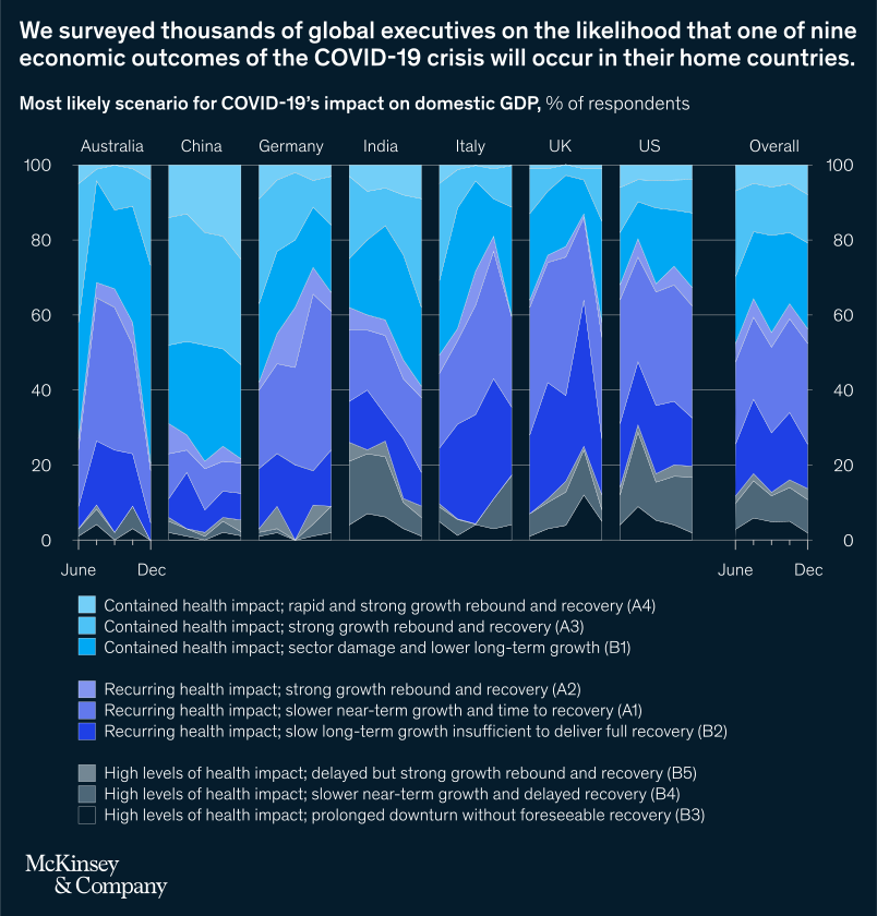
December 18, 2020 – Since June, we have surveyed thousands of global executives on what the COVID-19 crisis’s impact would be on domestic GDP based on the likelihood of nine economic scenarios. Throughout that time, respondents in China have reported a consistent—and consistently more optimistic—outlook.
To explore the interactive, see “Nine scenarios for the COVID-19 economy,” December 18, 2020.
customizer here
Visual form
Multi-panel stacked area chart.
Layout / body structure
The chart is laid out as eight narrow country panels side by side, one each for Australia, China, Germany, India, Italy, the UK, the US, and Overall. Read each panel from June to December and compare the stacked scenario bands across countries using the shared legend below.
What is being compared
The chart compares executives’ most likely scenarios for COVID-19’s impact on domestic GDP across seven countries plus an overall panel. Each panel compares the share of respondents assigning likelihood to one of nine economic scenarios, ranging from rapid rebound cases to prolonged downturn cases.
Measurement system
The measurement is percent of respondents. Every panel stacks to 100 percent, so the thickness of each colored band shows how much of the response mix sits in each scenario over time.
Visible structure inside the graphic
Each country column contains layered bands in three related color families: lighter blues for contained-health-impact rebound scenarios, mid blues for recurring-health-impact scenarios, and darker grays or deep navy for high-health-impact scenarios. The legend spells out the nine scenario names, and the relative thickness of the upper and middle blue bands differs sharply from country to country.
Main takeaway from the visual
Chinese executives appear much more concentrated in optimistic rebound scenarios than peers in many other countries, while other panels show a more mixed or darker scenario distribution. The China column stays heavily weighted toward lighter and brighter blue recovery bands, which makes its optimism stand out visually against the rest.
Key standout values or extremes
The most striking extreme is the dominance of the optimistic contained-health-impact bands in China across the June-to-December range. By contrast, several other countries, especially the UK, US, and Overall panels, show much larger shares in recurring-impact and darker slower-recovery bands, indicating more caution and dispersion in expectations.
Controls / sequence, when applicable
This is a static chart image with no in-chart controls to operate.
Companion media, when applicable
There is no separate companion audio or video; the chart image is the full visual on this page.