Source page: McKinsey & Company
Commentary
Many airlines should have already been rethinking their ‘hub’ models before the pandemic
COVID-19 | Travel
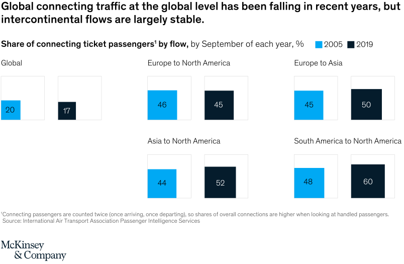
November 10, 2020 – Except for some international routes that had a stable or growing number of connecting flights, the global trend was toward nonstop, direct flights.
To read the article, see “Will airline hubs recover from COVID-19?,” November 5, 2020.
customizer here
Visual form
Multi-row before-and-after comparison chart.
Layout / body structure
The chart is a single table-like comparison with traffic-flow categories listed in rows and two year columns for 2005 and 2019. Read each row left to right to compare the older and newer share of connecting passengers, then move down the list of route flows.
What is being compared
It compares the share of connecting ticket passengers across global traffic and several intercontinental route flows: Europe to North America, Europe to Asia, Asia to North America, and South America to North America. The chart is contrasting 2005 with 2019 rather than tracing every year in between.
Measurement system
The measure is percentage share of connecting ticket passengers. Every row uses the same percent scale through the printed 2005 and 2019 values, which makes the change in hub dependence easy to compare across route types.
Visible structure inside the graphic
The visual is organized as a set of route-flow rows with paired year values, so the reader can see where the 2019 number is lower, flat, or higher than the 2005 number. The structure separates the global pattern from the intercontinental corridors, which is what allows the chart to show global decline alongside stable or rising long-haul flows.
Main takeaway from the visual
At the global level, connecting traffic was already becoming less important before the pandemic, but intercontinental connecting flows remained resilient and in some cases grew. The chart therefore undercuts a one-size-fits-all hub model and suggests airlines should have been differentiating by route type well before COVID-19.
Key standout values or extremes
The clearest anchors are the global decline from 20 percent in 2005 to 17 percent in 2019 and the growth on several long-haul corridors, including Europe to Asia from 45 to 50 percent, Asia to North America from 44 to 52 percent, and South America to North America from 48 to 60 percent. Europe to North America is the most stable row, slipping only from 46 to 45 percent.
Controls / sequence, when applicable
This is a static chart image with no in-chart controls to operate.
Companion media, when applicable
There is no separate companion audio or video; the chart image is the full visual on this page.