Source page: McKinsey & Company
Commentary
Before the pandemic, many US universities were in a student amenities spending arms race
Education | Public Sector | North America
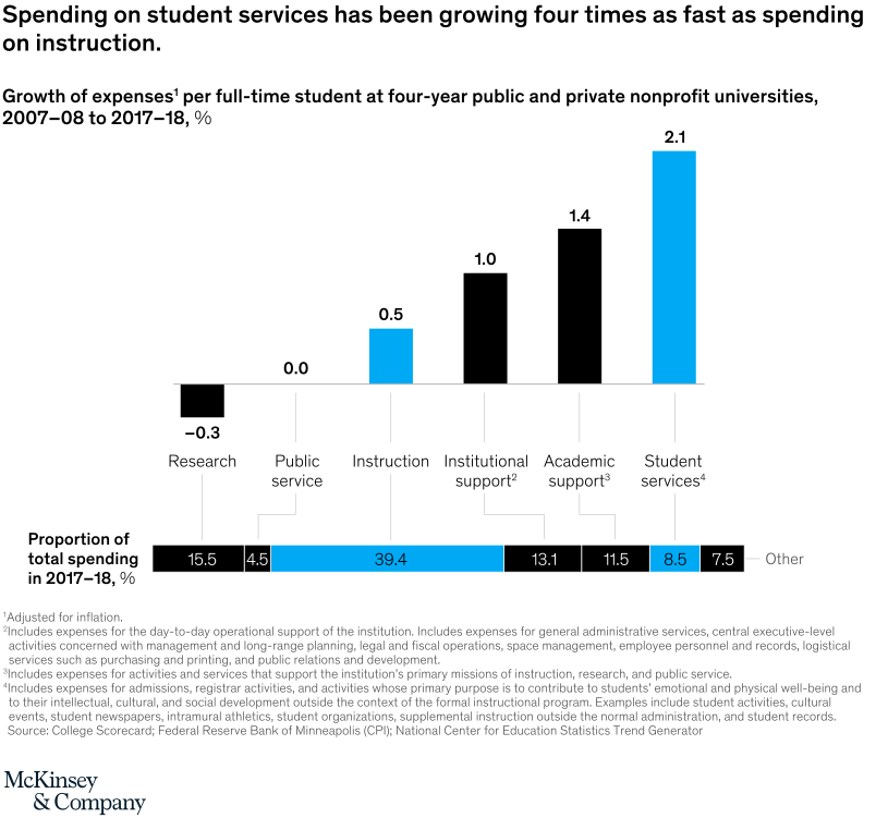
November 6, 2020 – To woo students, universities spent heavily on student amenities, including expansive offerings in entertainment, gourmet dining, and wellness. Spending on student services has grown four times faster than investments in instruction and research.
To read the article, see “Reimagining higher education in the United States,” October 26, 2020.
customizer here
Visual form
Two-row category comparison chart.
Layout / body structure
The chart is a single panel with the same spending categories shown in two stacked rows: growth in expenses per full-time student over ten years on top and the share of total spending in 2017-18 below. Read across the categories left to right in the top row first, then compare those same categories against the lower row of total-spending shares.
What is being compared
It compares university spending areas such as research, public service, instruction, institutional support, academic support, student services, and other expenses. The chart contrasts ten-year growth in per-student spending with the share of total spending each area represented at the end of the period.
Measurement system
The top row uses percentage growth in expenses per full-time student from 2007-08 to 2017-18, adjusted for inflation. The bottom row uses percentage share of total spending in 2017-18, so the reader is tracking both growth rates and spending mix for the same categories.
Visible structure inside the graphic
The chart repeats the same spending areas in both rows so the reader can compare growth and spending weight directly by category. Large end-state shares for research and instruction sit below small or flat growth figures, while the student-services column stands out because its growth is visibly stronger than its share of the total.
Main takeaway from the visual
Research and instruction still absorb the largest share of university spending, but student services were the fastest-growing major category before the pandemic. The chart makes the amenities race visible by showing student-services growth far outpacing growth in instruction and research.
Key standout values or extremes
Instruction accounts for 39.4 percent of total spending and research for 15.5 percent, making them the two largest budget areas. But over the decade, research spending per student fell 0.3 percent and instruction rose only 0.5 percent, while student services grew 2.1 percent even though they represented just 8.5 percent of total spending.
Controls / sequence, when applicable
This is a static chart image with no in-chart controls to operate.
Companion media, when applicable
There is no separate companion audio or video; the chart image is the full visual on this page.