Source page: McKinsey & Company
Commentary
Invest $1 in known health improvements, get up to $4 back in GDP
COVID-19 | Economics | Public Health
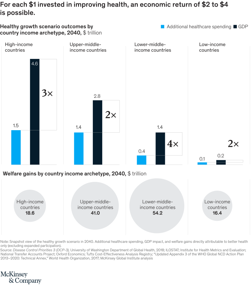
August 7, 2020 – Applying the approach used in economics to measure welfare, we estimate that the total value of fewer deaths and reduced ill health could reach up to $100 trillion, without income-level adjustments. That’s eight times the estimated GDP benefits.
To read the report, see “Prioritizing health: A prescription for prosperity,” July 8, 2020.
customizer here
Visual form
Bar Chart and Single KPI / Metric: healthcare-spending bars, GDP-return bars, and welfare-gain callouts.
Layout / body structure
The top row compares additional healthcare spending with projected GDP outcomes for four country-income archetypes. The bottom row uses large bubble-style KPI callouts to show welfare gains for the same archetypes.
What is being compared
It compares the economic return from investing in known health improvements across high-income, upper-middle-income, lower-middle-income, and low-income countries.
Measurement system
The top bars are measured in trillions of dollars in 2040. The return labels show GDP multiples, and the lower callouts show welfare gains in trillions of dollars.
Visible structure inside the graphic
In every income group, the GDP-return bar is taller than the added healthcare-spending bar. Lower-middle-income countries show the largest return multiple, while upper-middle-income countries have the largest welfare-gain callout.
Main takeaway from the visual
The chart shows that health improvement is an economic investment, not only a cost. Each dollar invested can produce multiple dollars of GDP return, with additional welfare gains beyond GDP.
Key standout values or extremes
High-income countries show 1.5 trillion dollars in added healthcare spending versus 4.6 trillion dollars in GDP, a 3-times return. Lower-middle-income countries show a 4-times return, from 0.4 trillion to 1.4 trillion dollars.
Controls / sequence, when applicable
This is a static bar chart with KPI callouts; there are no in-chart controls to operate.
Companion media, when applicable
There is no separate companion audio or video; the health-investment return chart is the full visual on this page.