Source page: McKinsey & Company
Commentary
Life expectancy more than doubled over the past century
Public Health
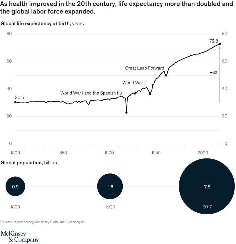
July 21, 2020 – Thanks to better hygiene and nutrition, antibiotics, vaccines, and new technologies, people today are living longer and have overall better health than they did in the past. Additionally, the world’s population has more than quadrupled since 1900.
To read the report, see “Prioritizing health: A prescription for prosperity,” July 8, 2020.
customizer here
Visual form
Long-run line chart for global life expectancy and bubble markers for global population.
Layout / body structure
The upper chart traces life expectancy from 1800 to 2017, with historical disruptions labeled. The lower row uses three population bubbles for 1800, 1900, and 2017.
What is being compared
It compares global life expectancy and global population across more than two centuries of health and demographic change.
Measurement system
Life expectancy is measured in years at birth. Global population is measured in billions of people, with bubble area scaled to population size.
Visible structure inside the graphic
Life expectancy stays near 30 years for a long period, dips during major crises, and then rises strongly after the mid-20th century. Population bubbles expand from small to very large by 2017.
Main takeaway from the visual
As health improved in the 20th century, global life expectancy more than doubled while the global labor force and population grew dramatically.
Key standout values or extremes
Life expectancy rises from 30.5 years in 1800 to 72.8 years in 2017, a gain of 42 years. Population increases from 0.9 billion in 1800 to 7.5 billion in 2017.
Controls / sequence, when applicable
This is a static chart image with no in-chart controls to operate.
Companion media, when applicable
There is no separate companion audio or video; the chart image is the full visual on this page.