Source page: McKinsey & Company
Commentary
A natural bounty
Sustainability
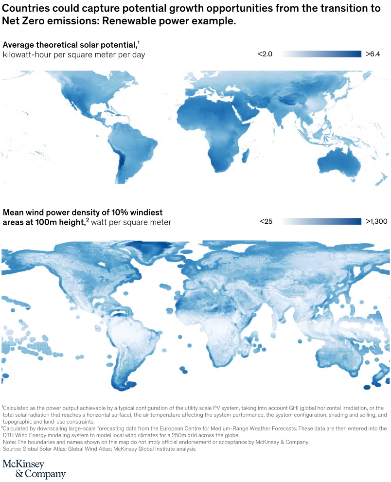
February 22, 2022 – Many countries possess rich stocks of so-called natural capital such as ample sunlight and wind, forestland, mineral resources, and CO2 sequestration potential. For example, Australia and Saudi Arabia have extensive solar resources, Argentina and the United Kingdom have high wind power potential, and Chile and China have large reserves of minerals. Capitalizing on these assets could be supported by flows of capital through mechanisms such as voluntary carbon markets.
To read the article, see “How the net-zero transition would play out in countries and regions,” January 25, 2022.
customizer here
Visual form
World map with dual resource legends.
Layout / body structure
The chart is a single world map with the headline above it and two resource scales explained in legends. Reader reads the title first, then uses the map body to compare regions, and finally uses the solar and wind legends to interpret how the shading corresponds to different renewable-resource intensities.
What is being compared
The map compares countries and regions by renewable-resource potential, specifically theoretical solar potential and wind power density in the windiest areas. It is a geography comparison rather than a time comparison, and it is asking the reader to see where the strongest renewable-power opportunity clusters globally.
Measurement system
The solar scale is measured in kilowatt-hours per square meter per day, while the wind scale is measured in watts per square meter for the 10 percent windiest areas at 100-meter height. The legends show the visible range from less than 2.0 to greater than 6.4 for solar and from less than 25 to greater than 1,300 for wind.
Visible structure inside the graphic
The center of the page is a geographic map, while the legends above and below it explain how to read the renewable-resource intensities. The chart also includes detailed notes beneath the map on how the solar and wind measures are calculated, so the graphic combines geographic shading with a methodological frame instead of standing as an unlabeled picture.
Main takeaway from the visual
Renewable-power opportunity is unevenly distributed, and some regions are visibly advantaged by natural endowments that could translate into stronger growth opportunities in a net-zero transition. The map is designed to make natural capital look location-specific, with sunlight and wind potential clustering differently across the globe rather than spreading evenly.
Key standout values or extremes
The visible solar legend tops out above 6.4 kilowatt-hours per square meter per day, and the wind legend tops out above 1,300 watts per square meter. Those upper-end legend values define the most resource-rich parts of the map and frame the strongest renewable-power opportunity zones on the page.
Controls / sequence, when applicable
This is a static chart image with no in-chart controls to operate.
Companion media, when applicable
There is no separate companion audio or video; the chart image is the full visual on this page.