Source page: McKinsey & Company
Commentary
Agile for all is coming—but how fast?
Organization | Agile
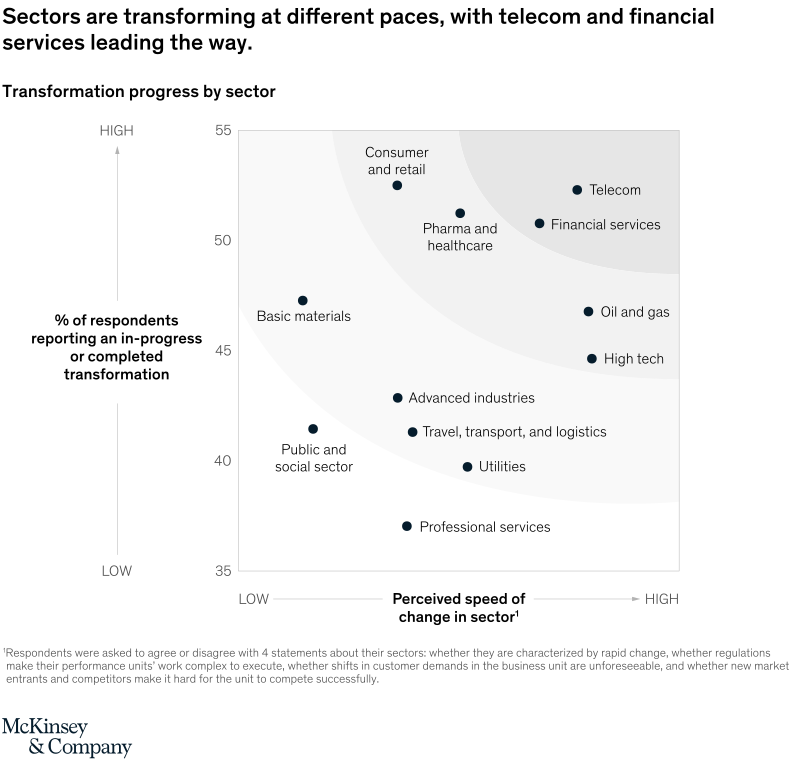
June 22, 2021 – McKinsey Global Surveys have tracked the progress of agile transformations since 2017. In the latest edition, more than 800 transforming organizations report that the shift to agile ways of working is happening fastest and most thoroughly in telecom and financial services
To read the survey, see “The impact of agility: How to shape your organization to compete,” May 25, 2021.
customizer here
Visual form
Sector-labeled scatter plot.
Layout / body structure
The chart is a single scatter chart with perceived speed of change running left to right and transformation progress running bottom to top. Reader scans the field by quadrant, then reads the labeled sector points individually, with the faint background contours reinforcing the upper-right versus lower-left spread.
What is being compared
The chart compares ten sectors by two dimensions at once: how fast respondents think change is happening in the sector and how many respondents report that transformation is already in progress or completed. Sectors include telecom, financial services, consumer and retail, pharma and healthcare, oil and gas, high tech, utilities, professional services, advanced industries, public and social sector, and travel, transport, and logistics.
Measurement system
The vertical scale shows the percent of respondents reporting an in-progress or completed transformation, roughly from 35 to 55 percent. The horizontal scale is a low-to-high perceived-speed-of-change axis without printed numeric ticks, so position across the plot indicates relative pace while the vertical placement carries the explicit percentage measure.
Visible structure inside the graphic
Each sector is shown as one labeled dot, which makes the display a position-comparison chart rather than a size or color comparison. The points spread from a lower-left cluster of slower-moving or less-transformed sectors to an upper-right cluster led by telecom and financial services, while consumer and retail sits high on transformation but a bit more leftward than the fastest-changing leaders.
Main takeaway from the visual
Telecom and financial services sit furthest toward the upper right, so they lead both on perceived pace of change and on visible transformation progress. Professional services, utilities, the public and social sector, and some transport-related sectors sit lower or farther left, which makes the sector landscape look uneven rather than uniformly agile.
Key standout values or extremes
Telecom is the highest and one of the furthest-right points on the page, with financial services close beside it, while professional services sits near the bottom of the chart at roughly the high-30s on transformation progress. Consumer and retail is one of the highest points vertically, just above 50 percent, but does not extend as far right as telecom or financial services, which visually separates strong progress from maximum perceived speed.
Controls / sequence, when applicable
This is a static chart image with no in-chart controls to operate.
Companion media, when applicable
There is no separate companion audio or video; the chart image is the full visual on this page.