Source page: McKinsey & Company
Commentary
Aiming for empowerment
Inequality | Economy
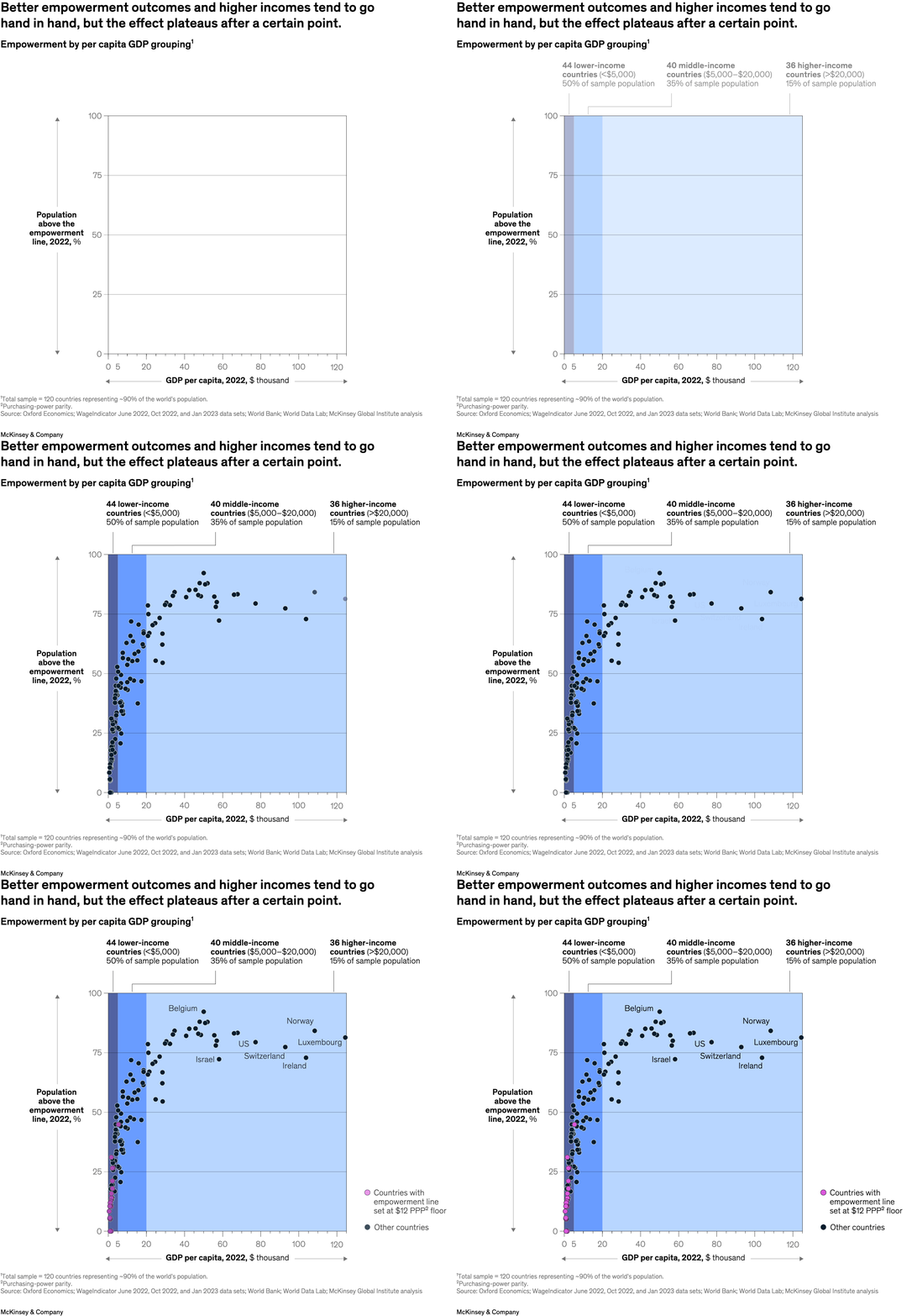
May 30, 2024 – The “empowerment line” is a threshold at which people can afford essential goods and services and build savings. And although higher income levels appear to correlate with better empowerment outcomes, those gains stall when countries exceed $20,000 in GPD per capita, according to senior partner Kweilin Ellingrud and colleagues. Struggling households see gains from higher incomes in wealthier countries only when they result in greater purchasing power. Wealthier economies haven’t managed to lift the last 20 percent of their populations above the empowerment line.
To read the article, see “A better life everyone can afford: Lifting a quarter billion people to economic empowerment,” May 20, 2024.
customizer here
Visual form
Scatter plot.
Layout / body structure
This is a single chart with many country dots plotted against one another, and the panel is divided by income-group shading. The reading order is across the GDP-per-capita axis first and then up the employment-population axis, with the highlighted countries labeled inside the field.
What is being compared
It compares empowerment outcomes against per capita GDP, showing how countries with different income levels sit along the relationship between income and employment-population outcomes.
Measurement system
The x-axis is GDP per capita in 2022, measured in thousands of dollars, and the y-axis is population above the empowerment line in 2022, measured as a percentage. Background shading groups the chart into lower-income, middle-income, and higher-income bands.
Visible structure inside the graphic
Most countries are shown as small dark dots clustered toward the left side, while a smaller set of labeled countries such as Belgium, the United States, Luxembourg, Norway, Switzerland, Ireland, and Israel are called out directly in the upper-right half of the chart.
Main takeaway from the visual
The plot shows a strong positive relationship between income and empowerment outcomes at lower and middle income levels, but the gains flatten at higher income levels, where richer countries cluster in a narrower upper band.
Key standout values or extremes
Most of the labeled high-income countries sit between roughly 75 and 90 percent on the y-axis, while the densest low-income cluster is packed below about $20,000 GDP per capita and below the upper-right plateau.
Controls / sequence, when applicable
This is a static chart image with no in-chart controls to operate.
Companion media, when applicable
There is no separate companion audio or video; the chart image is the full visual on this page.