Source page: McKinsey & Company
Commentary
Are we heading into a new era of prosperity?
COVID-19 | Economy
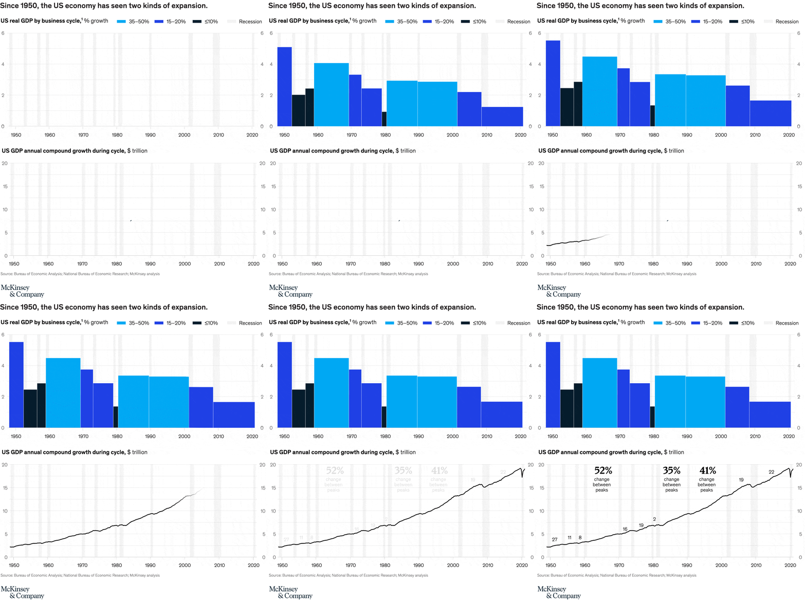
June 30, 2021 – History suggests that there are essentially two types of economic expansions after recession: those that see GDP grow by 10 to 20 percent cumulatively in postcrisis years, and those that see 30 to 50 percent cumulative growth. Our latest research suggests that the global economy could be on the verge of the latter—a “40 percent” recovery that delivers sustained and equitable growth for several years.
To read the article, see “Looking beyond the pandemic: Could the world economy gain more than it lost to COVID-19?,” June 14, 2021.
customizer here
Visual form
Two-panel macroeconomic chart combining business-cycle bars and a long-run line chart.
Layout / body structure
The chart stacks two panels vertically. Reader starts with the upper business-cycle panel, which groups colored growth segments across post-1950 expansions and recession bands, then moves down to the lower long-run GDP line that tracks annual compound growth during cycles and annotates peak-to-peak changes.
What is being compared
The top panel compares US real GDP growth across business cycles using three growth bands and recession periods, while the lower panel compares the scale of annual compound GDP growth across successive cycles over the same long-run history.
Measurement system
The upper panel measures percent growth with color-coded ranges for 35 to 50 percent, 15 to 20 percent, and 10 percent or less, plus gray recession shading. The lower panel measures GDP in trillions of dollars on a 0 to 20 scale and adds large percentage annotations for changes between peaks.
Visible structure inside the graphic
The top panel is built from adjacent colored bars aligned to the timeline from 1950 to 2020, with pale vertical recession bands behind them. The bottom panel uses a single rising black line across the same time span, punctuated by labels such as 27, 11, 8, 16, 19, 2, 19, and 22 and by three large mid-chart annotations showing 52 percent, 35 percent, and 41 percent changes between peaks.
Main takeaway from the visual
The upper panel shows that postwar expansions did not all look alike, with earlier decades showing stronger bursts and later periods looking more moderate. The lower panel still trends upward over the long run, but the changing peak-to-peak annotations make clear that the character of expansion has shifted rather than staying uniform across eras.
Key standout values or extremes
The strongest upper-panel segment sits in the early post-1950 period near the 5 to 6 percent level, while later cycles spend more time in the lower colored bands. In the lower panel, the callouts emphasize 52 percent, 35 percent, and 41 percent changes between peaks, and the line itself rises from roughly 2 to the high teens by the far right of the chart.
Controls / sequence, when applicable
This is a static chart image with no in-chart controls to operate.
Companion media, when applicable
There is no separate companion audio or video; the chart image is the full visual on this page.