Source page: McKinsey & Company
Commentary
Assessing US health
Healthcare | Public Health
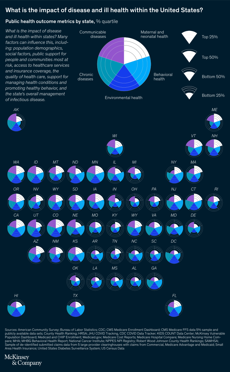
November 28, 2022 – As US health officials start to think beyond the immediate crises around COVID-19, there’s an opportunity to focus on broader health issues affecting Americans. But where to start? Senior partner Pooja Kumar and coauthors created McKinsey’s United States of Health Dashboard, highlighting key metrics, from chronic disease to maternal health, across all states. The dashboard features an interactive data visualization tool to help state and public leaders identify high-priority areas.
To read the article, see “Tracking public-health outcomes across the United States,” September 6, 2022.
customizer here
Visual form
Public-health dashboard.
Layout / body structure
The chart is a dashboard-style built around state-by-state health metrics rather than one fixed chart. Reader moves across topics such as chronic disease and maternal health and then drills into the geography of those outcomes across the United States.
What is being compared
It compares public-health outcomes across US states, with the dashboard bringing together multiple health measures instead of isolating one disease or one outcome.
Measurement system
The measurement system changes by topic, but the common structure is state-level health metrics and outcome rates. The dashboard uses the same geographic frame so different health categories can be compared inside one national view.
Visible structure inside the graphic
The internal pieces are the state map, the topic selectors, and the metric panels that expose different public-health outcomes. The visual anatomy is built around geography first and then around the set of health indicators that can be swapped into that frame.
Main takeaway from the visual
The page is designed to show that US health challenges are broad, measurable, and uneven across states. The dashboard framing makes the contrast between places and between health issues part of the point rather than background detail.
Key standout values or extremes
The strongest quantitative emphasis in the published page shell is not one single national number but the breadth of metrics shown in the United States of Health Dashboard, which ranges from chronic disease to maternal health across all states.
Controls / sequence, when applicable
This is a static chart image with no in-chart controls to operate.
Companion media, when applicable
There is no separate companion audio or video; the chart image is the full visual on this page.