Source page: McKinsey & Company
Commentary
Banks: Stuck in the middle
Banking
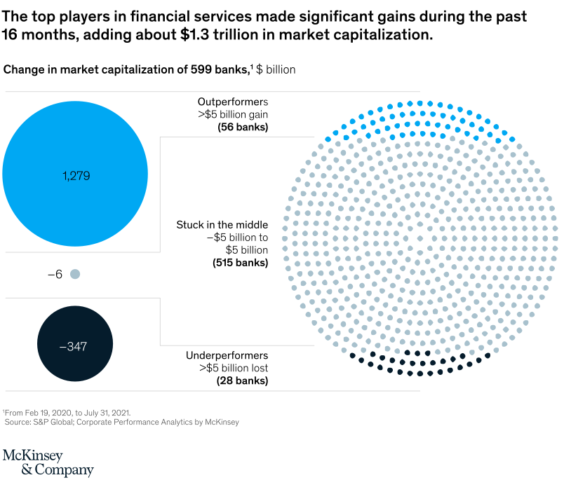
October 26, 2021 – After some big stock-market gyrations, banks may be wondering whose company they’re keeping. Market leaders have captured all of the rise in the sector’s market cap since March 2020. Some underperformers have had a year to forget. The vast majority are stuck in the middle, their valuations essentially unchanged.
To read the article, see “Capital markets’ message to financial institutions: Differentiate or perish,” September 28, 2021.
customizer here
Visual form
Bubble-plus-dot-matrix performance chart.
Layout / body structure
The chart has two coordinated parts: large summary bubbles on the left for total gains and losses, and a huge dot-matrix circle on the right showing how 599 banks are distributed across outperformers, the middle band, and underperformers. Reader takes the aggregate value created and destroyed first, then moves to the dot matrix to see how many institutions sit in each performance bucket.
What is being compared
The chart compares banks by change in market capitalization over the past 16 months. It contrasts outperformers with gains greater than 5 billion dollars, banks stuck in the middle between minus 5 and plus 5 billion dollars, and underperformers with losses greater than 5 billion dollars.
Measurement system
The bubbles on the left are measured in billions of dollars, showing plus 1,279, minus 6, and minus 347. The right-side dot matrix counts institutions, separating 56 outperformers, 515 banks in the middle, and 28 underperformers.
Visible structure inside the graphic
A large blue bubble labeled 1,279 dominates the upper left and a smaller dark bubble labeled negative 347 sits below it, with a small negative 6 dot between them. On the right, a large circular field of dots is mostly filled with pale middle-category dots, capped by a bright arc of blue outperformers at the top and a much smaller dark arc of underperformers at the bottom.
Main takeaway from the visual
A small group of leading banks captured almost all of the market-capitalization gains, while the overwhelming majority of institutions were stuck in the middle. The right-side dot matrix makes that concentration visible by showing only a thin band of outperformers and an even thinner band of underperformers around a huge middle mass.
Key standout values or extremes
The biggest aggregate gain is the 1,279-billion-dollar increase attributed to outperformers, compared with 347 billion dollars of losses for underperformers and only negative 6 billion in the middle bucket overall. In count terms, just 56 banks are in the outperformer bucket versus 515 in the middle and 28 in the underperformer bucket.
Controls / sequence, when applicable
This is a static chart image with no in-chart controls to operate.
Companion media, when applicable
There is no separate companion audio or video; the chart image is the full visual on this page.