Source page: McKinsey & Company
Commentary
Big difference between economic scenarios executives view as most likely
COVID-19 | Economy
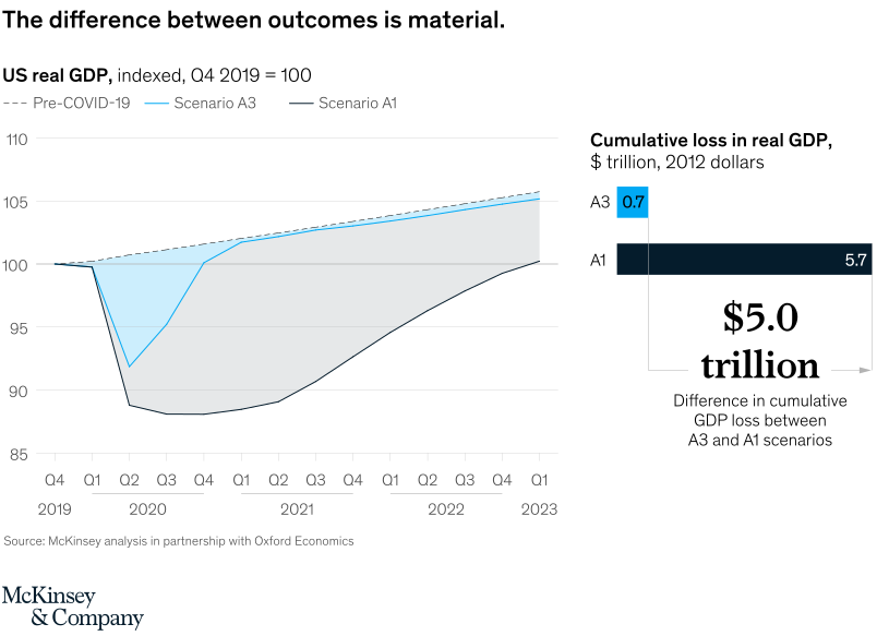
May 29, 2020 – Executives we surveyed view two economic scenarios as most likely—one where the virus is contained (A3) and the other where it recurs (A1). The potential difference between the two is $5 trillion in lost US GDP alone, and as high as $15 trillion to $20 trillion globally.
To read the article, see “Crushing coronavirus uncertainty: The big ‘unlock’ for our economies,” May 13, 2020.
customizer here
Visual form
GDP scenario line chart paired with a compact cumulative-loss bar comparison.
Layout / body structure
The main panel plots US real GDP indexed to Q4 2019 under pre-COVID-19, Scenario A3, and Scenario A1 paths. The right-side inset compares cumulative real GDP loss between A3 and A1.
What is being compared
It compares two possible US economic recovery paths and the cumulative real-GDP cost attached to each scenario.
Measurement system
The line chart indexes US real GDP to Q4 2019 equals 100. The loss inset is measured in trillions of 2012 dollars.
Visible structure inside the graphic
Scenario A3 drops but recovers quickly toward the pre-COVID trend. Scenario A1 falls deeper, stays below the trend for much longer, and produces a much larger cumulative-loss bar.
Main takeaway from the visual
The difference between recovery scenarios is economically material. A slower recovery creates a much larger output loss even if GDP eventually climbs back toward baseline.
Key standout values or extremes
The cumulative-loss inset labels A3 at 0.7 trillion dollars and A1 at 5.7 trillion dollars, leaving a 5.0 trillion dollar gap between the scenarios.
Controls / sequence, when applicable
This is a static chart image with no in-chart controls to operate.
Companion media, when applicable
There is no separate companion audio or video; the chart image is the full visual on this page.