Source page: McKinsey & Company
Commentary
Brighter days ahead
Economics | Jobs
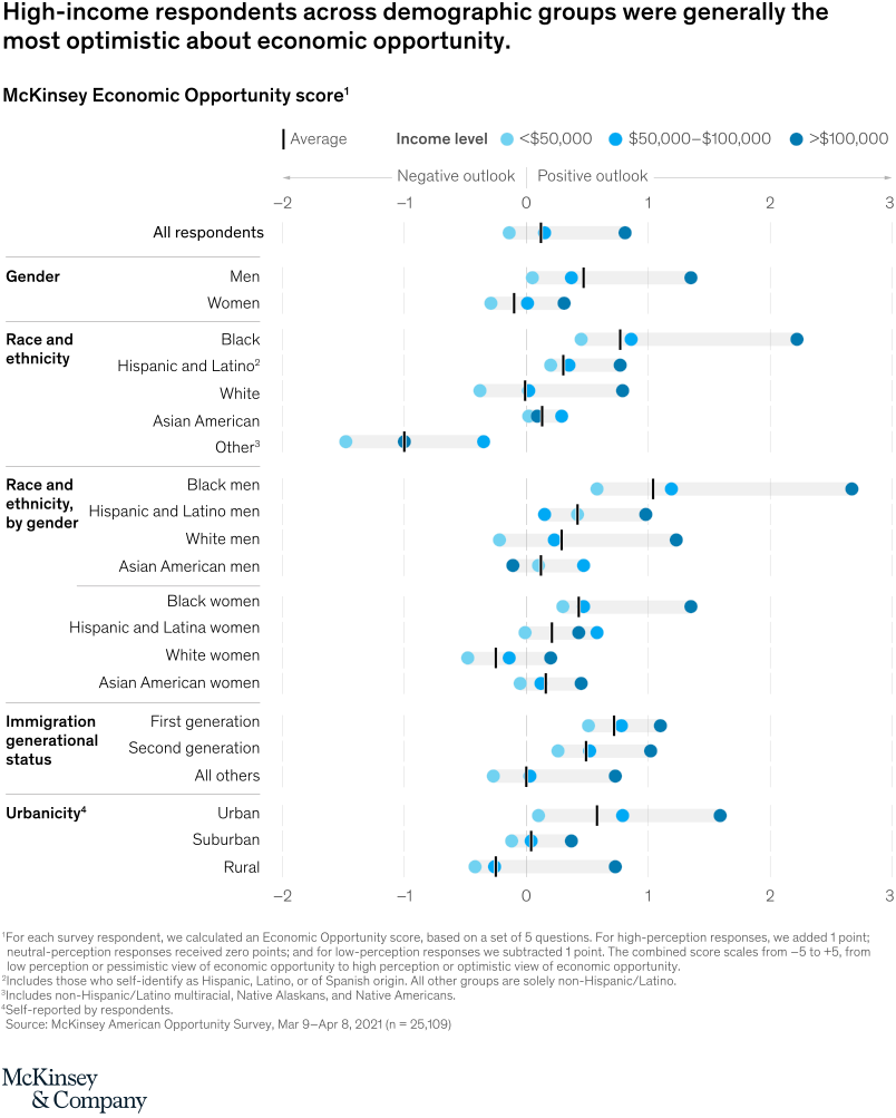
June 21, 2021 – The forecast is sunny for the US economy. Black and Hispanic/Latino workers were 60 percent more likely than white respondents to say they anticipate more economic opportunities in the next year. And 50 percent of first-generation immigrants say most Americans have opportunities to find good jobs.
To read the article, see “Unequal America: Ten insights on the state of economic opportunity,” May 26, 2021.
customizer here
Visual form
Multi-row dot plot with income-band markers and average ticks.
Layout / body structure
The chart is one large vertical list of demographic groups with a shared horizontal score axis running from negative outlook on the left to positive outlook on the right. Read top to bottom through the group categories, and within each row compare the three blue income-level dots against the black average tick before moving to the next demographic line.
What is being compared
The chart compares McKinsey Economic Opportunity scores across demographic groups such as gender, race and ethnicity, race and ethnicity by gender, immigration generational status, and urbanicity. Within every row it also compares three income bands: under 50,000 dollars, 50,000 to 100,000 dollars, and more than 100,000 dollars.
Measurement system
The horizontal axis is the McKinsey Economic Opportunity score, with the scale moving from negative outlook to positive outlook. Three blue dots show the income-band scores for each row, and a short black vertical tick marks the average score for that group.
Visible structure inside the graphic
Each demographic row combines a faint horizontal band with three colored dots and one average marker, so the reader sees both spread and center at once. The darkest blue higher-income dots generally sit furthest right, while the lower-income dots cluster closer to zero or negative territory, and the row labels create a hierarchy from broad groups to more specific intersections such as Black men or Asian American women.
Main takeaway from the visual
Higher-income respondents are consistently the most optimistic across nearly every demographic grouping, and the chart makes that pattern visible by placing the darkest blue dots furthest to the right in row after row. The chart also shows that optimism varies substantially inside racial and gender categories, with some intersectional groups sitting much further right than others on the same scale.
Key standout values or extremes
Black men in the more than 100,000 dollar income band appear furthest to the right at roughly the upper 2s on the score scale, making them one of the most optimistic groups on the page. By contrast, lower-income respondents in several groups sit near zero or below it, and the rural row overall sits left of the urban row, while first-generation immigrants plot to the right of the all-others benchmark.
Controls / sequence, when applicable
This is a static chart image with no in-chart controls to operate.
Companion media, when applicable
There is no separate companion audio or video; the chart image is the full visual on this page.