Source page: McKinsey & Company
Commentary
Canada’s productivity pinch
North America | Productivity
January 13, 2026 – Canada boasts abundant resources, top-notch talent, and market access, yet labor productivity has stalled. Real GDP per capita has decreased and the prosperity gap with the United States has widened. This slowdown isn’t a blip—it stems from years of investment drifting into lower-productivity, domestically oriented sectors and missed opportunities to scale exports in resources, services, and advanced industries, say McKinsey’s Elaine Almeida, Greg Kudar, Richard Luft, Rob Palter, and Zak Cutler. Investment—which drives 80 percent of productivity growth—in extractive sectors fell 15 percent from 2010 to 2023, and several energy projects have been canceled or deferred since 2014. Bold, focused action could turn the tide: If Canada seizes growth opportunities, households could be roughly $16,000 better off by 2035 and enjoy stronger job prospects.
To read the article, see “Addressing Canada’s productivity gap: A journey towards global leadership,” November 3, 2025.
customizer here
Visual form
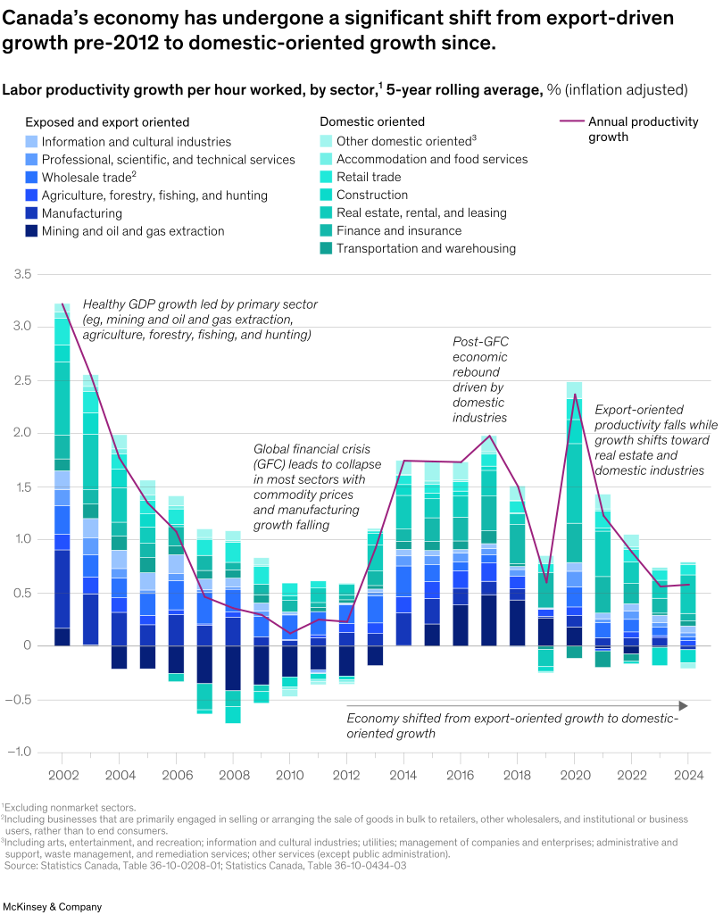
Combined stacked-bar and line chart.
Layout / body structure
The chart is a single wide chart with stacked bars for sector contributions and a magenta line for annual productivity growth laid over the same time axis. It reads left to right from the early 2000s through 2024, with the legend above splitting the stacked sectors into export-oriented and domestic-oriented groups.
What is being compared
It compares labor-productivity growth by sector over time and also compares the relative role of export-oriented sectors versus domestic-oriented sectors in driving that growth. At the same time, the overlay line compares the overall annual productivity-growth pattern against the composition of the stacked sector contributions underneath it.
Measurement system
The y-axis shows labor productivity growth per hour worked as a five-year rolling average in inflation-adjusted percent, and the x-axis runs from 2002 to 2024. The stacked bars show how much each sector contributes to the total in a given year, while the magenta line tracks the overall annual productivity-growth level across the same period.
Visible structure inside the graphic
The chart uses deep blue stacks for export-oriented sectors and teal stacks for domestic-oriented sectors, all grouped under a single yearly bar. A magenta line runs across the bars, and explanatory callouts mark the early export-led phase, the global financial crisis collapse, the domestic-industry rebound period, and the later slowdown as growth shifts toward real estate and domestic industries.
Main takeaway from the visual
The visual shows Canada shifting away from export-driven productivity growth toward a more domestic-oriented pattern, but without generating stronger aggregate productivity as a result. The early years show strong contributions from primary and export sectors, while the later years show more domestic contribution alongside a weaker overall growth line.
Key standout values or extremes
The annual productivity-growth line sits above 3 percent in the early 2000s, drops sharply through the global financial crisis period, rebounds to roughly 2 percent in the mid-to-late 2010s, spikes again around 2020, and then fades back toward well under 1 percent by the end of the series. The annotation on the chart makes the structural shift itself a standout, moving from export-oriented growth before 2012 to domestic-oriented growth afterward.
Controls / sequence, when applicable
This is a static chart image with no in-chart controls to operate.
Companion media, when applicable
There is no separate companion audio or video; the chart image is the full visual on this page.