Source page: McKinsey & Company
Commentary
Countries that focused on keeping virus spread near zero got their economies moving faster than others
COVID-19 | Public Health | Economics
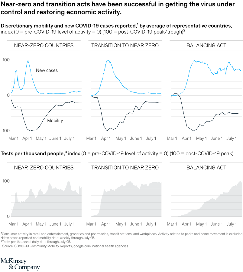
September 15, 2020 – Countries that took measures aimed at near-zero coronavirus-infection rates did a much better job at increasing “discretionary mobility” (getting people back out shopping, commuting, and working) than did those that balanced higher infection rates with fewer restrictions on economic activity.
To read the article, see “COVID-19: Saving thousands of lives and trillions in livelihoods,” August 17, 2020.
customizer here
Visual form
Multi-panel line chart comparison.
Layout / body structure
The chart is arranged as a grid of small multiples with three country-group columns: Near-zero countries, Transition to near zero, and Balancing act. Read left to right across the three strategy groups, and within each column read the upper mobility-and-new-cases panel before moving down to the lower testing panel.
What is being compared
The chart compares three different pandemic-control approaches and shows how each one tracks across new COVID-19 cases, discretionary mobility, and testing intensity. The comparison is between country-group trajectories, not between single countries in isolation.
Measurement system
The upper row uses indexed measures for both discretionary mobility and reported new cases, with 0 marking the pre-COVID-19 activity baseline for mobility and 100 marking the post-COVID-19 peak or trough reference. The lower row uses tests per thousand people as an index on the same three-column country-group layout.
Visible structure inside the graphic
Each of the three columns contains a top panel with two overlaid time lines, a blue line for new cases and a dark line for mobility, plotted from early March into July. Beneath that, a second row repeats the same three-column structure for testing, so the reader can compare disease control, behavior recovery, and testing effort side by side for each strategy group.
Main takeaway from the visual
The near-zero and transition-to-near-zero groups recover mobility much more strongly once cases are brought down, while the balancing-act group keeps cases elevated and mobility remains more depressed. The structure makes that visible by showing the mobility line climbing back much closer to normal in the first two columns than in the third.
Key standout values or extremes
In the upper row, the near-zero and transition groups both drive the blue cases line down toward the bottom of the scale after an early peak, while the balancing-act column keeps the cases line high for much longer. The mobility line in the near-zero group falls sharply early on but recovers to much less negative levels by late June and July, whereas the balancing-act group stays visibly farther below normal.
Controls / sequence, when applicable
This is a static chart image with no in-chart controls to operate.
Companion media, when applicable
There is no separate companion audio or video; the chart image is the full visual on this page.