Source page: McKinsey & Company
Commentary
Cutting class—often
Education | COVID-19
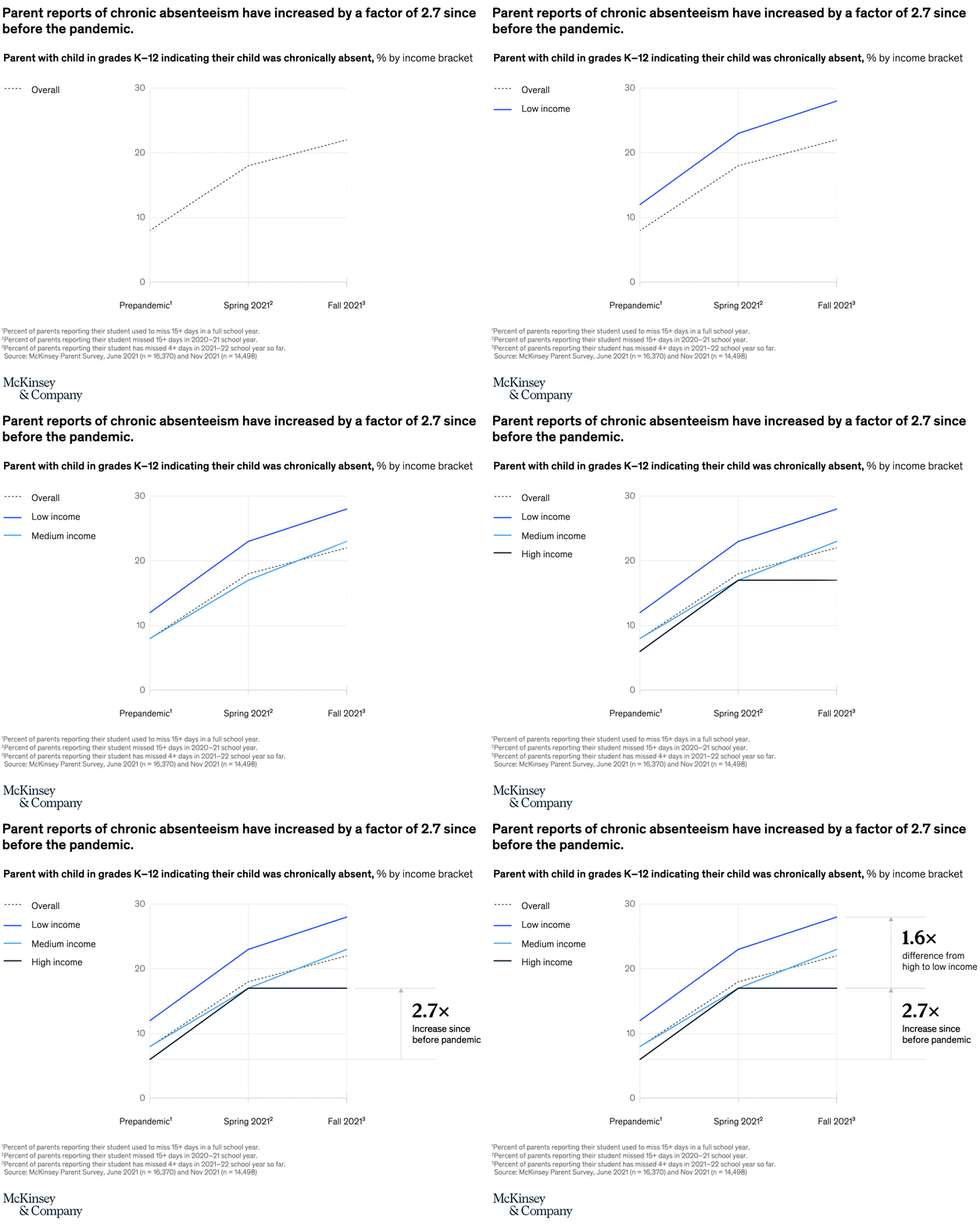
March 14, 2022 – Chronic absenteeism has soared for students since the onset of the pandemic, more than doubling from 8 percent prepandemic to 22 percent in fall 2021. Students from low-income households, who are more likely to encounter attendance barriers, were 1.6 times as likely as their high-income-household peers to be chronically absent from school.
To read the article, see “COVID-19 and education: An emerging K-shaped recovery,” December 14, 2021.
customizer here
Visual form
Multi-series line chart.
Layout / body structure
The chart is one time-series plot with three time points spread across the horizontal axis and multiple income-bracket lines traced through them. Reader moves from prepandemic to spring 2021 to fall 2021 and compares how the overall, low-income, medium-income, and high-income lines separate as absenteeism rises.
What is being compared
The chart compares parent-reported chronic absenteeism for children in grades K through 12 across income brackets and across three time periods. It is simultaneously a time comparison and an income-group comparison.
Measurement system
The measure is the percent of parents indicating their child was chronically absent, with the vertical axis labeled in percentage terms. Callouts at the right summarize the key multipliers, including the increase since before the pandemic and the gap from high-income to low-income households.
Visible structure inside the graphic
Several colored lines run across the same three time points, with the overall series and the income-bracket series stacked visually by height at the right edge. The chart adds a right-side annotation block, so the final read combines the line endpoints with the written multipliers about widening inequality and overall growth.
Main takeaway from the visual
Chronic absenteeism rises sharply from the prepandemic level to fall 2021, and the low-income line ends clearly above the high-income line. The visual shows both a broad upward shift for everyone and a widening class gap rather than a uniform increase.
Key standout values or extremes
The chart highlights an overall level of 30 percent, a 1.6x difference from high income to low income, and a 2.7x increase since before the pandemic. Those callouts make the right edge of the graph the key reading point, with fall 2021 visibly higher than the earlier two periods.
Controls / sequence, when applicable
This is a static chart image with no in-chart controls to operate.
Companion media, when applicable
There is no separate companion audio or video; the chart image is the full visual on this page.