Source page: McKinsey & Company
Commentary
Dealing with disruption
Risk | Resilience | Growth
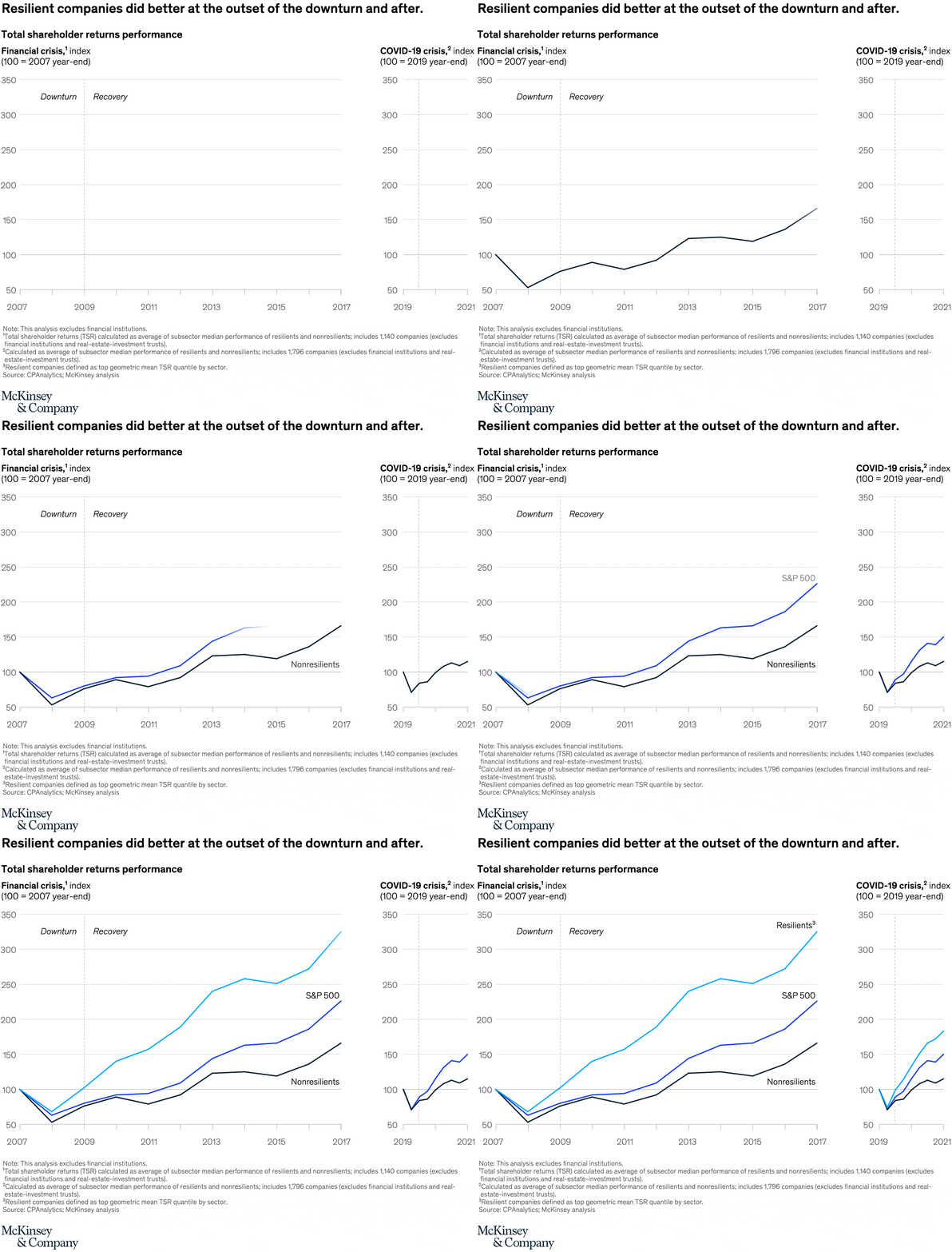
June 20, 2022 – Resilient organizations bounce back better—and even thrive—during times of disruption. McKinsey’s research has shown that companies evaluated as more resilient generated greater shareholder value than less resilient peers across the entire life cycle of the major economic shocks of the past two decades, including the world financial crisis of 2007–09 and the COVID-19 pandemic.
To read the article, see “Resilience for sustainable, inclusive growth,” June 7, 2022.
customizer here
Visual form
Two-panel line chart.
Layout / body structure
The chart places two aligned time-series panels side by side, one for the financial crisis and one for the COVID-19 crisis. Reader scans the left panel first, then the right panel, following the same three lines through downturn and recovery phases in each crisis.
What is being compared
The chart compares total shareholder returns for resilient companies, the S&P 500, and nonresilient companies across two different market shocks. It is a crisis-versus-crisis comparison and a performance-group-versus-performance-group comparison at the same time.
Measurement system
Both panels use indexed total shareholder returns with a baseline of 100 at the pre-crisis year-end, so the reader tracks relative gains and losses rather than raw dollar values. Color and direct labels identify the resilient, S&P 500, and nonresilient lines, while the two crisis titles reset the time frame for each panel.
Visible structure inside the graphic
Each panel contains three colored lines moving through an early decline and a later recovery. A divider between downturn and recovery phases, repeated line ordering, and matching axes make it possible to compare not just who finished highest, but who fell less and recovered faster in each crisis.
Main takeaway from the visual
Resilient companies visibly outperform at the start of the disruption and continue widening the gap in the recovery, while nonresilient companies stay at the bottom. The same pattern appears in both panels, which makes the resilience effect look persistent rather than crisis-specific.
Key standout values or extremes
The key numeric anchor is the index baseline of 100 in both panels. The strongest visual extreme is the spread that opens after the downturn, with the resilient line ending highest, the S&P 500 in the middle, and the nonresilient line lowest in both the financial-crisis and COVID-19 views.
Controls / sequence, when applicable
This is a static chart image with no in-chart controls to operate.
Companion media, when applicable
There is no separate companion audio or video; the chart image is the full visual on this page.