Source page: McKinsey & Company
Commentary
Diverse building blocks
Diversity & Inclusion | Economic Development
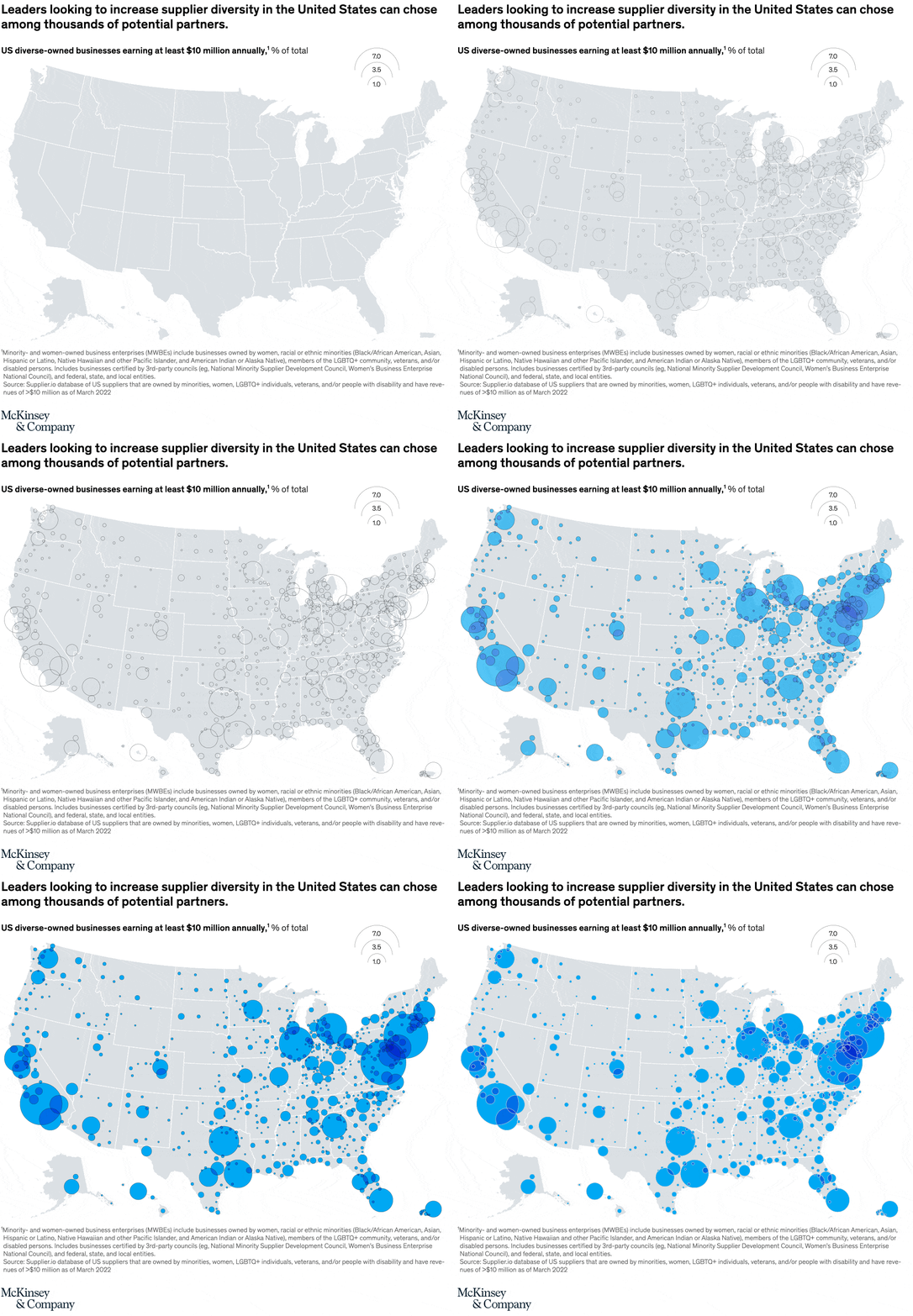
June 27, 2022 – An estimated 10,000 businesses owned by minorities, women, LGBTQ+ people, veterans, and people with disabilities earn at least $10 million annually. Los Angeles, New York, and Washington, DC, are home to more of those business enterprises than any other city in the United States.
To read the article, see “Expand diversity among your suppliers—and add value to your organization,” May 17, 2022.
customizer here
Visual form
Bubble map of the United States.
Layout / body structure
The page uses one national map with circles placed over metropolitan locations and a bubble-size legend in the upper-right corner. Reader scans geographically across the country, then checks the legend to judge how much larger the biggest metro circles are than the rest.
What is being compared
The chart compares metro areas across the United States by the presence of diverse-owned businesses earning at least $10 million annually. The comparison is spatial first, showing where those businesses are concentrated, and quantitative second, using bubble size to show how large each metro’s pool is relative to others.
Measurement system
The map does not use axes. Geographic position identifies the metro area, while circle area encodes the scale shown in the legend, which marks reference sizes at 10, 35, and 70. The subtitle frames the universe as US diverse-owned businesses earning at least $10 million annually.
Visible structure inside the graphic
The circles blanket the country, but they are densest along the Northeast corridor, California, Texas, the Southeast, and the Great Lakes region. The largest bubbles sit over major metro hubs, while the interior of the map is populated by many smaller circles that show a broad but thinner national spread.
Main takeaway from the visual
The map shows that supplier diversity at this revenue level is not confined to one corridor, but the deepest concentration of potential partners sits in large coastal and major urban markets. The visual makes the difference between a national footprint and a highly uneven metro concentration easy to see.
Key standout values or extremes
The legend’s largest reference bubble is 70, and the biggest circles on the map cluster around the largest metro areas rather than the interior. Los Angeles, New York, and the Washington, DC area stand out visually as some of the heaviest concentrations, with many secondary metros filling in beneath them at much smaller sizes.
Controls / sequence, when applicable
This is a static chart image with no in-chart controls to operate.
Companion media, when applicable
There is no separate companion audio or video; the chart image is the full visual on this page.