Source page: McKinsey & Company
Commentary
European productivity revival plan
Europe | Productivity
November 6, 2025 – This week, our charts focus on productivity—from achieving successful transformations to advanced-manufacturing projects and more.
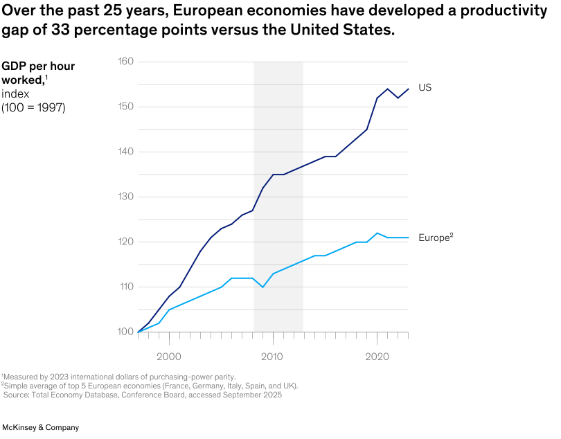
Europe faces a pivotal productivity challenge, note Senior Partner Ruth Heuss and coauthors. Over the past 25 years, labor productivity growth per hour has fallen by two-thirds, leaving Europe 33 percentage points behind the United States. In an increasingly winner-takes-all world, recovery demands a bold mindset shift: targeted investments, rapid technology adoption, and next-generation operational excellence. By combining innovation with strong leadership and workforce upskilling, European businesses can regain momentum. With decisive action, they can turn today’s lag into renewed competitiveness—boosting productivity for long-term prosperity while preserving Europe’s social contract.
To read the article, see “To unleash productivity growth in Europe, rewire your operations,” September 18, 2025.
customizer here
Visual form
Two-series line chart tracking productivity over time for the United States and Europe.
Layout / body structure
The chart is a single chart that reads left to right across time, with one dark line for the United States and one light-blue line for Europe. A shaded vertical band sits over the middle years, and the line labels are placed directly at the right edge of the chart instead of in a separate legend.
What is being compared
It compares GDP per hour worked in the United States and Europe from 1997 through the early 2020s, using a common index baseline to show how the two trajectories have diverged over the last 25 years.
Measurement system
The vertical axis is an index where 100 equals 1997. The horizontal axis tracks calendar time, and the direct labels at the line ends identify which trajectory belongs to the United States and which belongs to Europe.
Visible structure inside the graphic
The dark-blue US line climbs steadily and then accelerates again in the late 2010s and early 2020s, while the light-blue Europe line rises more slowly and then flattens much earlier. The gray shaded band marks a middle period where both lines continue but the gap remains visible.
Main takeaway from the visual
The chart shows a persistent and widening productivity gap, with the United States pulling away from Europe over time rather than the two lines converging.
Key standout values or extremes
By the right side of the chart, the United States is a little above 150 on the index while Europe is near 121, matching the headline claim of a 33 percentage point gap. Both lines start near 100 in 1997, which makes the later separation especially visible.
Controls / sequence, when applicable
This is a static chart image with no in-chart controls to operate.
Companion media, when applicable
There is no separate companion audio or video; the chart image is the full visual on this page.