Source page: McKinsey & Company
Commentary
Exit strategy? Check
Jobs
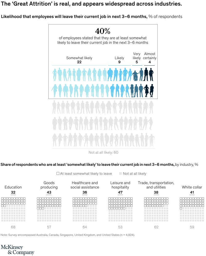
October 4, 2021 – In the US alone, more than 15 million workers have quit their jobs since April 2021. We surveyed employers and employees in Australia, Canada, Singapore, the UK, and the US to find out what’s driving this mass exodus. The result? Forty percent of the employee respondents said they are at least somewhat likely to quit in the next three to six months. While these findings were broadly consistent across industries, the leisure and hospitality industry are the most at risk for losing employees.
To read the article, see “‘Great Attrition’ or ‘Great Attraction’? The choice is yours,” September 8, 2021.
customizer here
Visual form
Combined icon-array infographic and small-multiple waffle-chart display.
Layout / body structure
The chart starts with a large central summary box at the top and then drops into a second row of industry-specific mini charts beneath it. Read the headline 40 percent panel first, then move left to right across the six industry waffle charts in the lower section.
What is being compared
The visual compares how likely employees say they are to leave their current jobs in the next three to six months, first overall and then by industry. The lower row contrasts education, goods producing, healthcare and social assistance, leisure and hospitality, trade transportation and utilities, and white-collar workers.
Measurement system
The measurement is percent of respondents. The top panel breaks the 40 percent likely-to-leave share into somewhat likely, likely, very likely, and almost certainly categories, while the bottom row uses 10-by-10 waffle grids to show the at-least-somewhat-likely share against the not-at-all-likely remainder for each industry.
Visible structure inside the graphic
The top box uses rows of human silhouettes with darker figures highlighting the likely leavers and faded figures underneath for the 60 percent not at all likely group. The lower section repeats compact square grids for each industry, with the filled portion sitting at the top of each grid and the complement printed below.
Main takeaway from the visual
The page shows that planned attrition is not a fringe issue but a broad pattern across industries, with a large overall share of employees open to leaving and some sectors standing out as even more exposed than the average.
Key standout values or extremes
The top-line figure is 40 percent at least somewhat likely to leave, made up of 22 percent somewhat likely, 9 percent likely, 5 percent very likely, and 4 percent almost certainly. In the lower row, leisure and hospitality is highest at 47 percent, followed by goods producing at 43 percent and white-collar roles at 41 percent, while education is lowest at 32 percent.
Controls / sequence, when applicable
This is a static chart image with no in-chart controls to operate.
Companion media, when applicable
There is no separate companion audio or video; the chart image is the full visual on this page.