Source page: McKinsey & Company
Commentary
Fortifying the grid
Climate change | Decarbonization | Electric power and natural gas
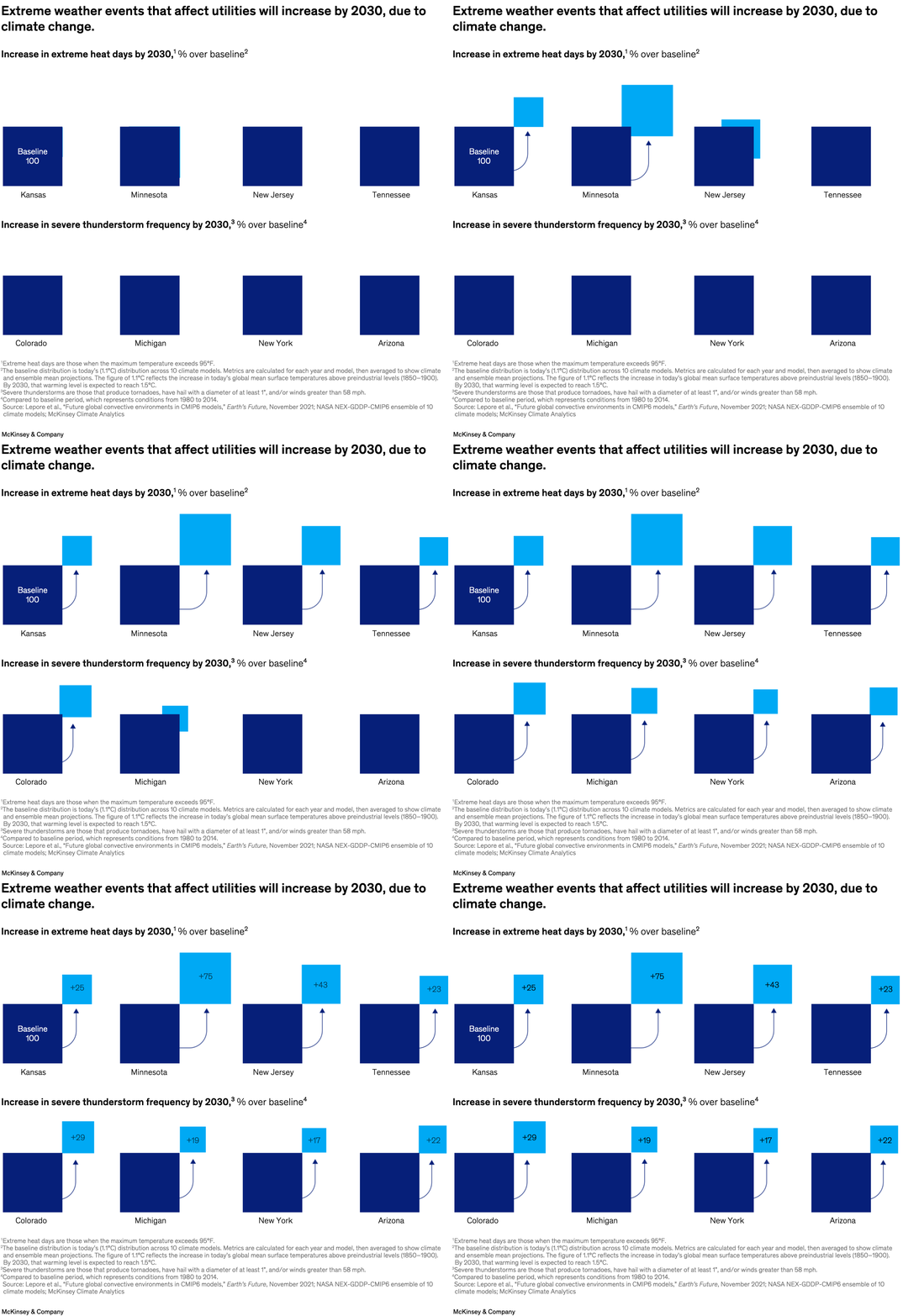
January 11, 2024 – Extreme weather events can pose a threat to the performance and reliability of power grids—especially when there’s a high demand for electricity. In the United States, for example, Minnesota could see a 75 percent increase in extreme heat days by 2030 while Colorado expects a 29 percent increase in severe thunderstorm frequency, partner Alfonso Encinas Fernandez and coauthors note. To address future grid needs, planners and utilities can consider taking an integrated approach to system planning.
To read the article, see “Grid planning under uncertainty: Investing for the energy transition,” December 5, 2023.
customizer here
Visual form
Multi-panel image sequence. The page uses a paired weather-risk comparison graphic rather than a single axis chart, with state-by-state callouts showing projected changes in two different hazard types.
Layout / body structure
Layout / body structure: the chart is arranged in two horizontal rows read from left to right and then top to bottom. The top row covers increases in extreme heat days by 2030, and the bottom row covers increases in severe thunderstorm frequency by 2030, with a note block beneath the state examples.
What is being compared
What is being compared: the visual compares projected climate-related risk increases across selected US states and across two hazard categories. It puts state examples side by side so the reader can compare where extreme heat rises most sharply and where thunderstorm frequency is expected to climb fastest.
Measurement system
Measurement system: the top row uses additional days as the unit for extreme heat, while the bottom row uses percentage increase for severe thunderstorm frequency. The labels are printed directly on each state callout, so the reader tracks the change value from box to box instead of reading off axes.
Visible structure inside the graphic
Visible structure inside the graphic: each row is made of state-specific square callouts with large numeric labels, state names, and a consistent visual treatment that makes the two hazard families easy to scan separately. The repeated card structure turns the chart into a small-multiple comparison instead of a continuous plot.
Main takeaway from the visual
Main takeaway from the visual: the projected strain on the grid is not uniform, but the direction is consistently upward across both weather hazards. The graphic makes the regional spread visible by showing that some states face much steeper increases in extreme heat while others stand out more on storm frequency.
Key standout values or extremes
Key standout values or extremes: Minnesota is labeled with a 75 percent increase in extreme heat days by 2030, which is the largest heat figure shown in the top row. Colorado carries a 29 percent increase in severe thunderstorm frequency, while New Jersey shows 43 percent more extreme heat days and Arizona shows a 22 percent rise in thunderstorm frequency.
Controls / sequence, when applicable
This is a static chart image with no in-chart controls to operate.
Companion media, when applicable
There is no separate companion audio or video; the chart image is the full visual on this page.