Source page: McKinsey & Company
Commentary
From lab to jab: Global flows of COVID-19 vaccine
COVID-19 | Public Health | Logistics
February 10, 2021 – Europe and three countries (China, India, and the United States) will produce 90 percent of the first wave of COVID-19 vaccine doses. African and other Asian countries will be the largest importers. It’s an unprecedented—and deeply complex—task for global logistics.
To read the article, see “Is the world up to the challenge of mass COVID-19 vaccination?,” February 8, 2021.
customizer here
Visual form
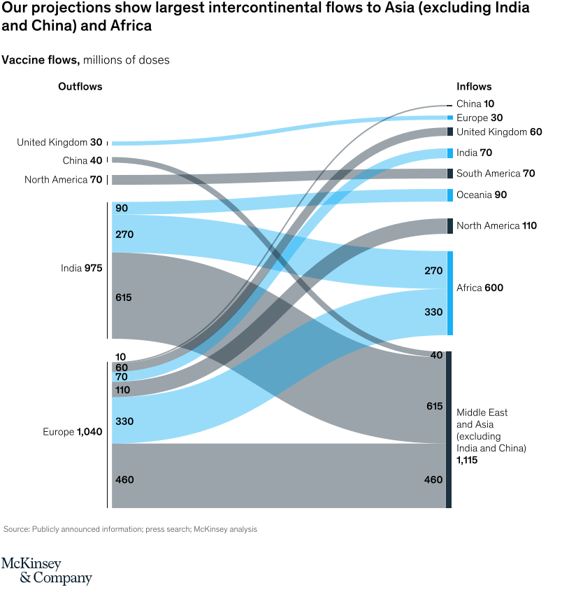
Sankey flow diagram.
Layout / body structure
The chart is a single left-to-right flow chart with source regions listed as outflows on the left and destination regions listed as inflows on the right. Read it from the source totals at left, through the crossing bands in the middle, to the receiving regions on the right.
What is being compared
The chart compares projected intercontinental COVID-19 vaccine flows between producing regions and receiving regions. It is a source-region-versus-destination-region comparison at the level of major world geographies.
Measurement system
The measurement is millions of doses. Region totals are printed beside each source and destination label, and the thickness of each band is reinforced by numeric labels placed on the larger flows.
Visible structure inside the graphic
Five source rows appear on the left: the United Kingdom, China, North America, India, and Europe. Nine destination rows appear on the right, and the center is filled with thick blue and gray ribbons labeled with values such as 10, 60, 70, 90, 110, 270, 330, 460, and 615 to show how the major streams split and combine.
Main takeaway from the visual
The biggest receiving blocks are Middle East and Asia excluding India and China, and Africa, and those large inflows are fed mainly by Europe and India. The smaller destination rows at the top receive noticeably thinner streams, which makes the regional concentration of supply visually obvious.
Key standout values or extremes
Europe is the largest projected outflow source at 1,040 million doses and India is close behind at 975 million. On the receiving side, Middle East and Asia excluding India and China takes 1,115 million doses and Africa takes 600 million, while the largest visible lanes include Europe sending 460 and 330 and India sending 615 and 270.
Controls / sequence, when applicable
This is a static chart image with no in-chart controls to operate.
Companion media, when applicable
There is no separate companion audio or video; the chart image is the full visual on this page.