Source page: McKinsey & Company
Commentary
Growth to the rescue
COVID-19 | Economy
July 22, 2021 – World governments have taken on significant debt to fight COVID-19. But problems from a debt overhang are not inevitable. After World War II in the United States, and in many other examples over time, the debt burden was reduced by driving nominal growth, not by cutting debt.
To read the article, see “Looking beyond the pandemic: Could the world economy gain more than it lost to COVID-19?”, June 14, 2021.
customizer here
Visual form
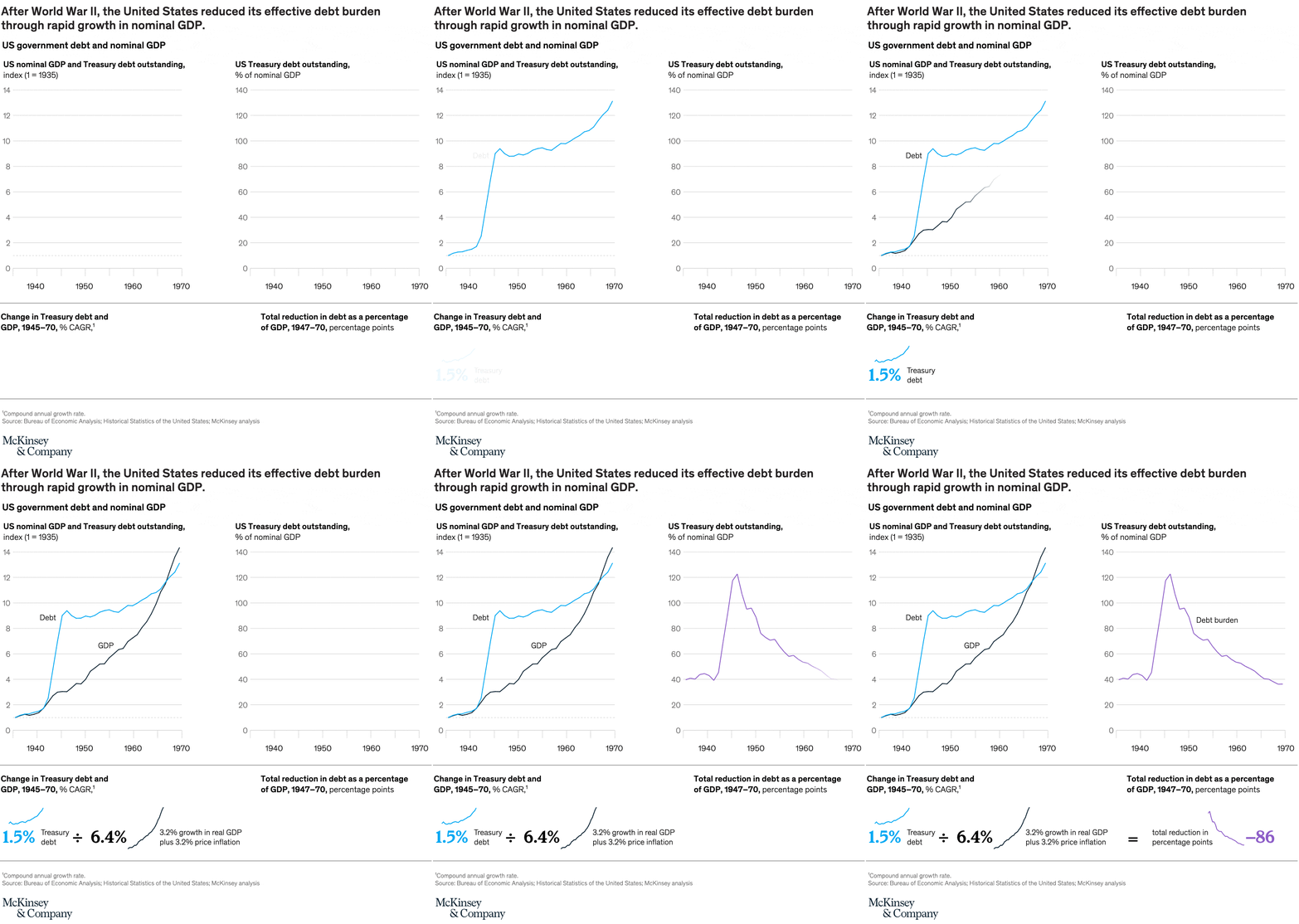
Two-panel historical line chart with a formula-style summary strip.
Layout / body structure
The chart is arranged as two main charts across the top and a summary equation band across the bottom. Read the left chart first for indexed nominal GDP and Treasury debt, then move to the right chart for debt outstanding as a share of GDP, and finish with the lower strip that condenses the mechanism into one arithmetic statement.
What is being compared
The left panel compares U.S. nominal GDP and Treasury debt outstanding from the mid-1930s through 1970. The right panel compares Treasury debt outstanding as a percent of nominal GDP over the same era, and the bottom strip compares the growth rates and total reduction that explain the falling debt burden after World War II.
Measurement system
The left chart uses an index with 1 equal to 1935, the right chart uses debt as a percent of nominal GDP, and the lower strip uses CAGR percentages plus the total reduction in percentage points. Black and blue lines distinguish GDP and debt in the left panel, while purple lines are used for debt-burden measures in the right and bottom sections.
Visible structure inside the graphic
The top left panel shows two rising lines that separate after World War II, with GDP accelerating past debt by the late 1960s. The top right panel shows one line peaking above 120 percent before trending downward for decades. The bottom strip simplifies the story into debt growth of 1.5 percent versus 6.4 percent nominal GDP growth, ending with an equals sign and a highlighted reduction of 86 percentage points.
Main takeaway from the visual
The United States reduced its effective debt burden after World War II not by shrinking debt in absolute terms but by growing nominal GDP much faster than debt. The visual proof is the widening gap between GDP and debt in the left panel and the long downward slope in debt as a share of GDP on the right.
Key standout values or extremes
Debt burden peaks a bit above 120 percent of nominal GDP in the mid-1940s and falls to the mid-30s by around 1970. The bottom strip shows Treasury debt growing at 1.5 percent CAGR versus nominal GDP at 6.4 percent CAGR, and it summarizes the total reduction in debt as a percentage of GDP from 1947 to 1970 at 86 percentage points.
Controls / sequence, when applicable
This is a static chart image with no in-chart controls to operate.
Companion media, when applicable
There is no separate companion audio or video; the chart image is the full visual on this page.