Source page: McKinsey & Company
Commentary
How data breaches are focusing minds
Cybersecurity | Technology
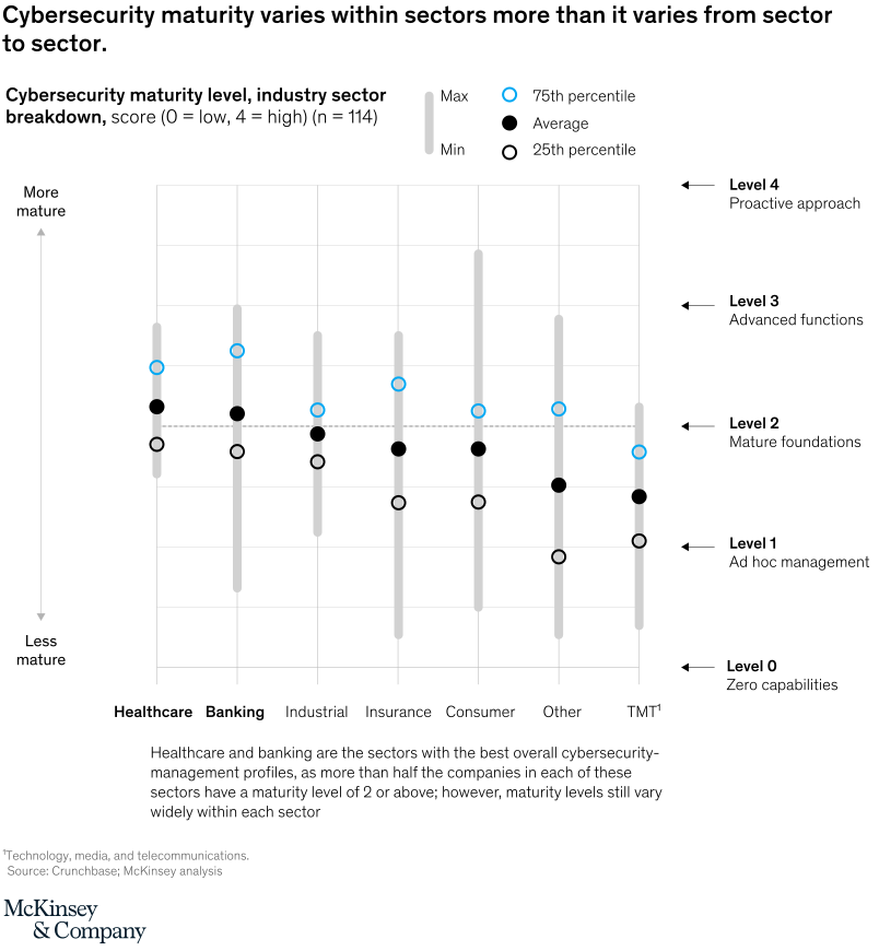
September 7, 2021 – The threat of consequences drives some industries—particularly banking and healthcare—to strengthen their cybersecurity efforts. Both sectors face regulatory scrutiny and rising consumer expectations. Our survey also finds that across sectors, cybersecurity readiness varies widely.
To read the article, see “Organizational cyber maturity: A survey of industries,” August 4, 2021.
customizer here
Visual form
Percentile-and-range dot plot by sector.
Layout / body structure
The chart is a single sector comparison chart laid out left to right across seven industries on a shared vertical maturity scale. Read each sector column from the gray range bar through the percentile markers and average dot, then compare the columns across the row.
What is being compared
The chart compares cybersecurity maturity distributions across healthcare, banking, industrial, insurance, consumer, other, and TMT. It is comparing sectors against one another while also comparing the spread inside each sector.
Measurement system
The scale runs from 0 to 4, where 0 is zero capabilities and 4 is a proactive approach. Each gray vertical bar shows the min-to-max span, the open black dot marks the 25th percentile, the solid black dot marks the average, and the open blue dot marks the 75th percentile; the dotted horizontal line marks level 2, labeled mature foundations.
Visible structure inside the graphic
Each sector appears as a vertical stack of markers on one gray range bar. The right side labels the five maturity levels, so the reader can judge which sectors sit above or below the level-2 threshold and how far their internal distributions stretch.
Main takeaway from the visual
The biggest visual story is the width of the ranges inside sectors, not a clean separation between sectors. Healthcare and banking sit highest on average, but nearly every column stretches across multiple maturity levels, which shows that companies within the same sector are often farther apart than sector averages suggest.
Key standout values or extremes
Healthcare and banking post the highest average dots, both a little above level 2, while TMT has the lowest average, around the mid-1s. Consumer shows one of the widest spans, reaching from well below level 1 up toward level 3.5, and both healthcare and banking place their 75th-percentile markers around the mid-2s.
Controls / sequence, when applicable
This is a static chart image with no in-chart controls to operate.
Companion media, when applicable
There is no separate companion audio or video; the chart image is the full visual on this page.